…While you were out.
September 10, 2024
Summer, unofficially, is over. Over the past several weeks when our attention was elsewhere, maybe watching the Olympics, several organizations decided this was the time to launch their new brand identities. Are you aware that Verizon, BNY, and the San Francisco International Airport have all rebranded?
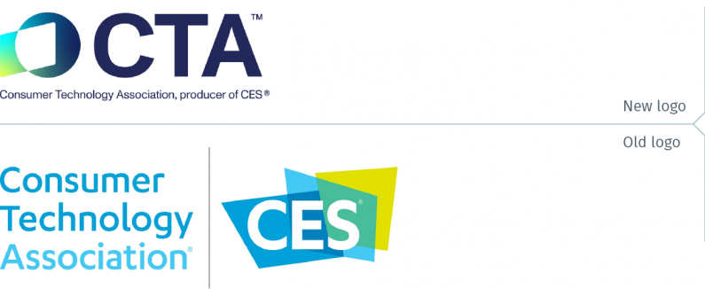
The Consumer Technology Association (CTA)® launched its new brand identity at the end of August. CTA owns and produces CES (the behemoth technology trade show held every January in Las Vegas). The previous CTA logo was just a lockup of its name to the CAS logo. Both CTA and the new CES logo share the symbol and brand identity system.
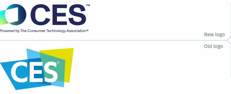
One has to hope that the cut lines below both logos are transitionary, intended to educate its stakeholders about the relationship between CTA and CES. The type is so small that it is virtually impossible to read. This is especially the case when a small logo is used, such as on their website.
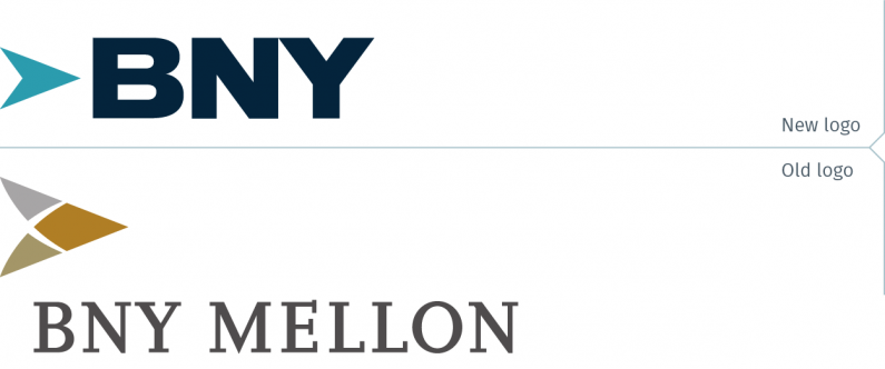
The Bank of New York Mellon Corporation introduced its new logo just before the beginning of the summer. The logo simplifies the brand name to BNY. The new logo is cleaner and more powerful than the old logo. However, before the merger of the Mellon Financial Corporation and the Bank of New York, the latter had a truly wonderful logo, evoking the filigree of old secure documents (such as stock certificates and currency) but executed in a unique, modern design. It’s too bad BNY couldn’t find a way to resurrect that symbol. It would have been better than the rather generic new logo.

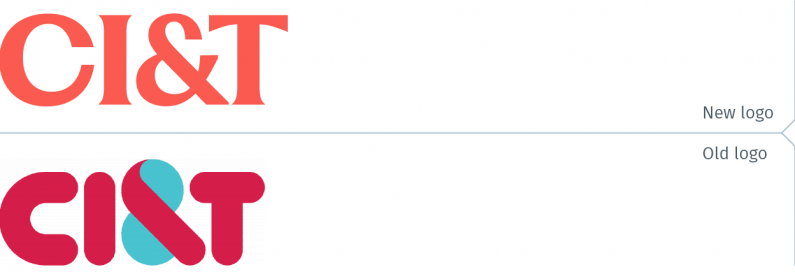
CI&T, a global technology company, unveiled its new brand identity in mid-August. In its press release, the company claims the new logo is bolder and more modern. Well, yes, the new logo is an improvement over the bubble-like old logo. But is the best result for a leading tech company touting its proprietary AI platform? Countless other design options would have better represented the brand.
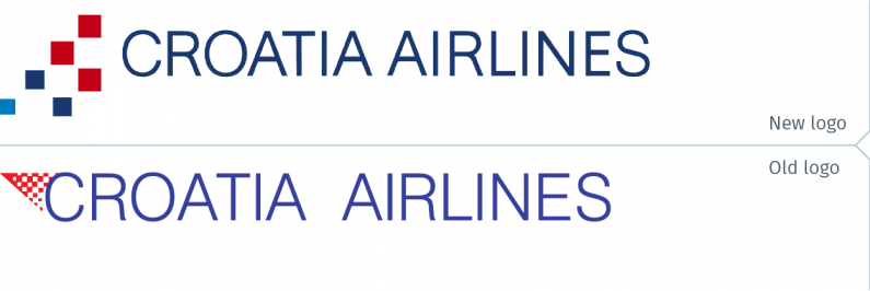
Timed to celebrate its 35th anniversary, Croatia Airlines, Croatia’s flag carrier, launched its new brand identity. While both the new and old logo draw inspiration from the Croatian flag for inspiration, the new logo is a better design.

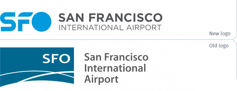
The San Francisco International Airport (SFO) launched its new brand identity at the beginning of August. This marked the end of the “flight lines” logo after 24 years of use. The new logo is focused on SFO, the IATA airport code, with the “S” being a fluid path, the “F” representing a wing, and the “O” being a portal. It is said to represent “the spirit of our rich history, the dynamism of the present, and the boundless possibilities of the future.” That sounds fine, and the new logo is competently designed. Unfortunately, part of the elegance and sophistication of the previous logo has been lost in the rebrand.
flysfo.com
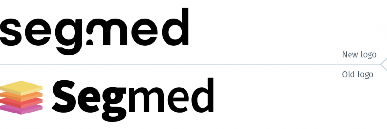
A leader in AI-powered medical imaging, Segmed launched its new brand identity on July 1st. Part of the rebranding exercise included the renaming of Segmed Insight to Openda, the new identity for the company’s Insight Platform. Viewed on its own, the new Segmed wordmark is an improvement over the old logotype. That logotype displayed a heavier weight font for the “Seg” portion of the name. Unfortunately, there wasn’t enough of a visual difference between it and the “med” segment to make it effective. The new wordmark presents a unified look for the whole name, with a break in the “m”, mirrored by the same half-circle effect in the Openda wordmark.

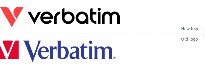
Verbatim, the well-known brand of USB drives and other storage products, such as memory cards (used in still and video cameras), unveiled its new brand identity at the Computex trade show in Taipei just as summer began. Verbatim is owned by CMC Magnetics, a Taiwanese company. The new logo is a marked improvement over the previous one, though one would have wished the ascenders (the vertical stroke of the “b” and the “t”) were not quite as short.
verbatim.com
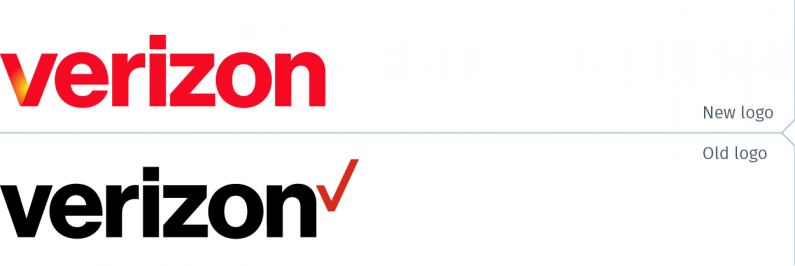
Verizon launched its new brand identity at the beginning of summer, timed to be unveiled at the same time as the introduction of a number of new products and services. The new wordmark is nearly identical to the old logo, without, of course, the checkmark. The new “v” is slightly wider, with the bottom corners slightly rounded. Making the wordmark red is a welcome change, but one wishes the yellow glow in the “v” was more prominent. Even if the yellow created a bit of break in the character’s diagonal left stroke, it would not have hurt its legibility.

One can’t help but wonder why these companies launch their new brand identities when people are not paying attention. It is widely recognized that organizations must properly communicate to introduce their new brand identity. If there is a communications vacuum, others will step in, with typically negative impact on the organization. Or are they introducing their new brand identities hoping no one will notice, the equivalent of politicians issuing press releases on a late Friday afternoon, knowing that the public won’t pay attention at the start of a weekend?
Finally, if you did not spend a couple of weeks of the summer glued to the television watching the Paris Olympic Games, below is the official video of the opening ceremony. Nothing during the Games equaled the emotion of the extraordinary rendition by Céline Dion of the iconic Edith Piaf song, Hymne à l’amour. Fast forward to about the 3-hour, 58-minute mark to watch it, or watch it again.


