Are brands becoming moody?
April 5, 2024
Maybe it’s due to the onslaught of news for the past few months, but newspaper columnists and other commentators have noted that people are in an ornery mood. Is that impacting the tone of companies’ rebranding efforts? This blog takes a quick look at a sample of recent new logos: Iittala, Thomson Reuters, itel, Wayfair, GoTo Foods, and, well, Moody’s. Are these new brands moody?
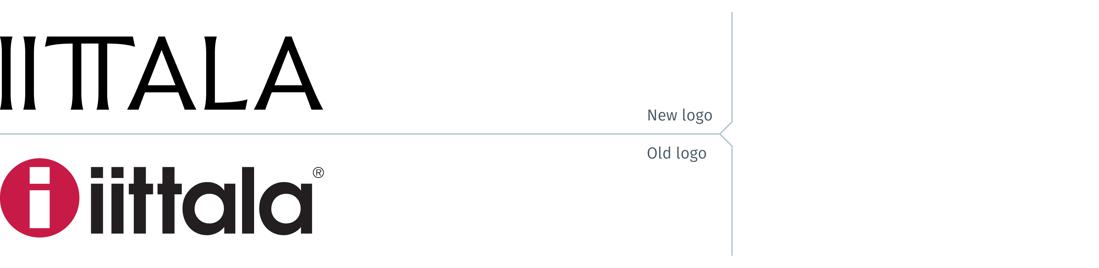
Iittala, the famous glass company from Finland recently rebranded. No longer a maker of high end glassware and vases designed by Alvar Aalto, the company has expanded its products to also include cutlery and pots and pans. Iittala logo has abandoned its lowercase sans serif logotype and red dot to an all-black, capitalized wordmark. While one may first think this is an appropriate direction for a fashion-related brand, it is undone by simply atrocious letter spacing. This becomes all the more glaring at a small scale; the logo appears to be II TT ALA. For a brand that celebrates design, this is inexcusable.
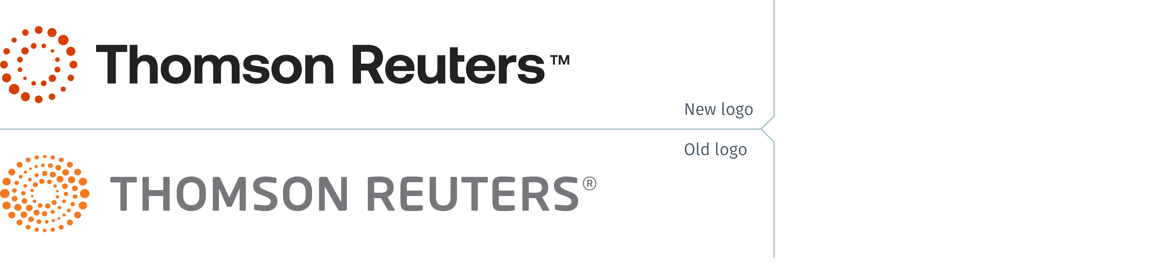
The global technology and global content company (including Reuters, the news-gathering organization) rebranded last month and unveiled a refreshed logo. With a new brand promise, “To Clarify the Complex”, their old logo had to be modified, or dispensed with entirely. The company opted for the former, simplifying the symbol by reducing the number of rings, reducing the number of dots in the rings, and changing the colour to a darker orange. The logotype is now black instead of grey and upper and lowercase instead of all caps. While the new logo is clearer and less complex, one can’t help but wish they had gone back to the old Reuters logo – which inspired the older Thomson Reuters logo launched 16 years ago – to also provide creative fodder for this latest rebranding effort.
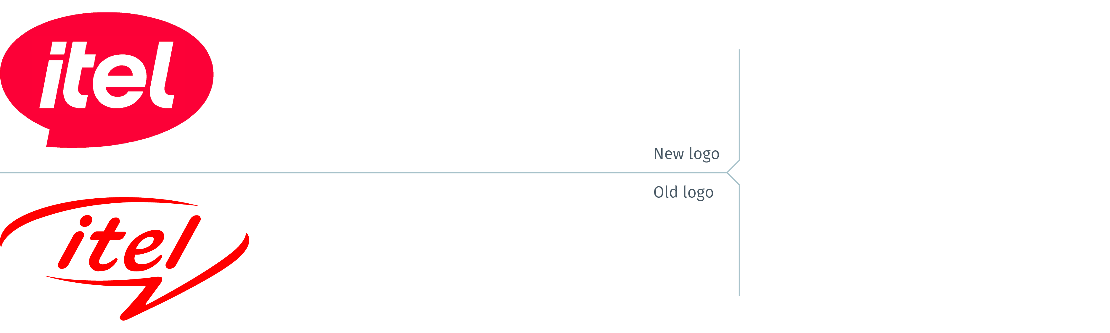
itel Mobile, a China-based mobile phone manufacturer company selling its products in various emerging markets, including parts of Africa, South Asia, Southeast Asia, Europe, and Latin America, rebranded late last year. The product portfolio now includes (in addition to smartphones) smartwatches, televisions, laptops, and small kitchen appliances, as well as electric razors. The new logo is reasonably well executed, with a stronger logotype and details such as the angle in the speech bubble duplicating the angle of the italic lettering. That stated, considering that the rationale for the rebrand is that it is evolving from a mobile phone brand into a comprehensive “smart life” brand, retaining a speech bubble as its mark makes no sense. While it may be relevant for smartwatches and even laptops, it doesn’t make any sense for an electric kettle or fan or electric razor. There are any number of other shapes that would have been much more relevant and communicated more effectively that itel no longer just makes phones.
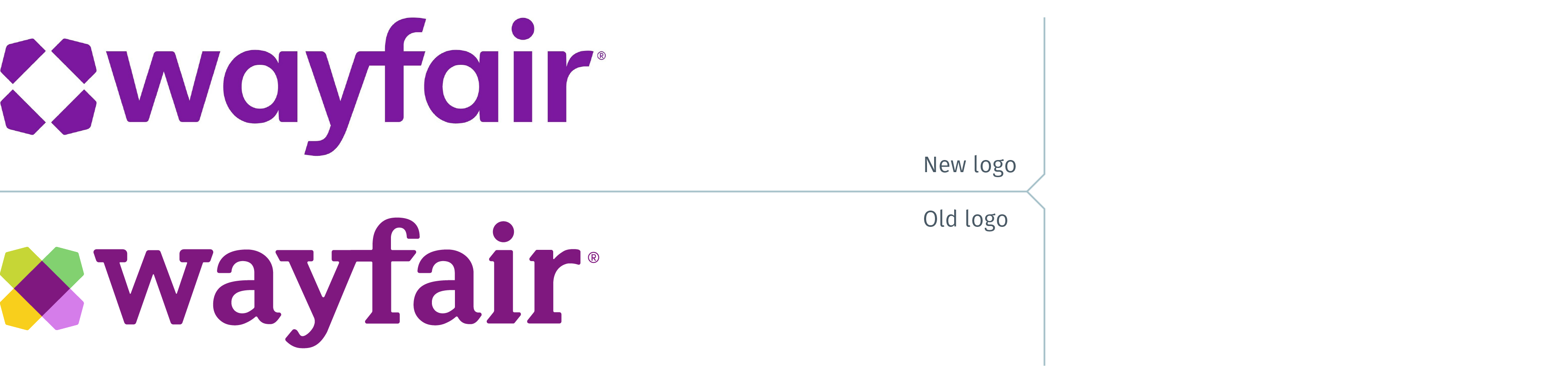
Wayfair, “the destination for all things home, in one inspiring place” until primarily an online discount vendor, unveiled its refreshed brand last month. The company’s other brands include AllModern, Birch Lane, Joss & Main, and Perigold. The new logo is approachable and more contemporary while maintaining its discount appeal. The bluer tone of purple is also more appealing. One wishes, however, that their update of the symbol had retained additional colours. Something is lost in translation of the logo from being multi-coloured to its now monochromatic state.

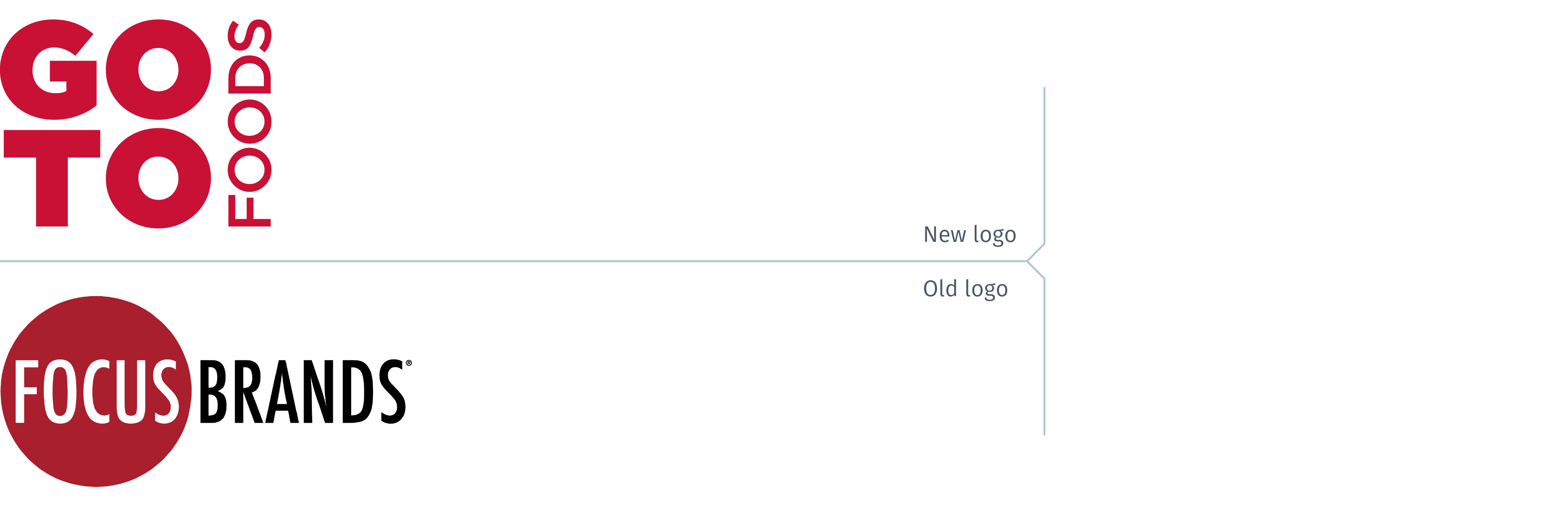
Focus Brands, the parent company of the Auntie Anne’s®, Carvel®, Cinnabon®, Jamba®, McAlister’s Deli®, Moe’s Southwest Grill®, and Schlotzsky’s® brands, announced in late February that they had rebranded with a new name, GoTo Foods. The Atlanta-based company states it is “the franchisor and operator of more than 6,700 restaurants, cafes, ice cream shoppes, and bakeries in all 50 states and over 60 countries.” This is an interesting new name and logo. The name, GoTo, captures the idea of fast food, or take out food franchises. If there is one critical observation of the new logo it is that rather than a franchisor and operator of foodservice brands, it could be mistaken as a competitor to Pret A Manger or the upscale sandwich take-out brands that one finds in many cities.

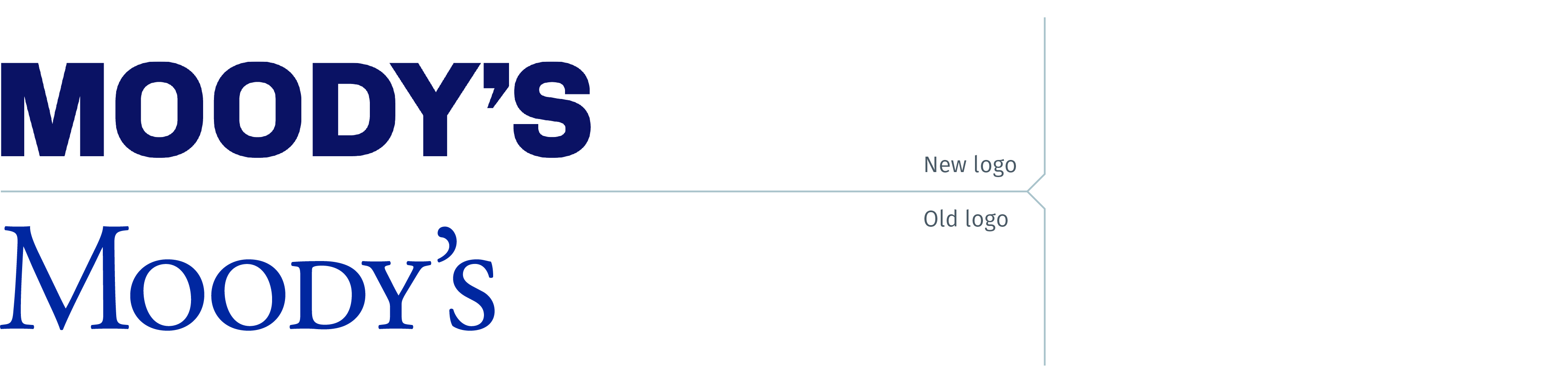
Last month, Moody’s, the global risk assessment firm with operations in more than 40 countries, unveiled its new brand identity. With their brand purpose, “To uncover meaning amid uncertainty so that individuals and organizations can thrive,” the new logo is a no-nonsense, assertive wordmark. Gone is the stodgy formality of the old wordmark with short Small Caps in royal blue. The new wordmark with its bold lettering in dark blue is confidant, assertive and serious. No one would assume that this is a warm, caring brand. Even the slightly condensed Os and the D ensure that this is a “take-no-prisoners” brand. Round O’s and D’s would have suggested a more inviting, open brand. Moody’s is having none of this. What else can you expect from a company whose brand launch video is titled, “It Starts With Us?”

When companies rebrand, every detail is important. What kind of face will they paint on? Just like a mime with raised eyebrows, black lips, or a bit of rouge on her painted white face; these details change the tone of the new logo and affect the perceptions its audiences have of the brand.