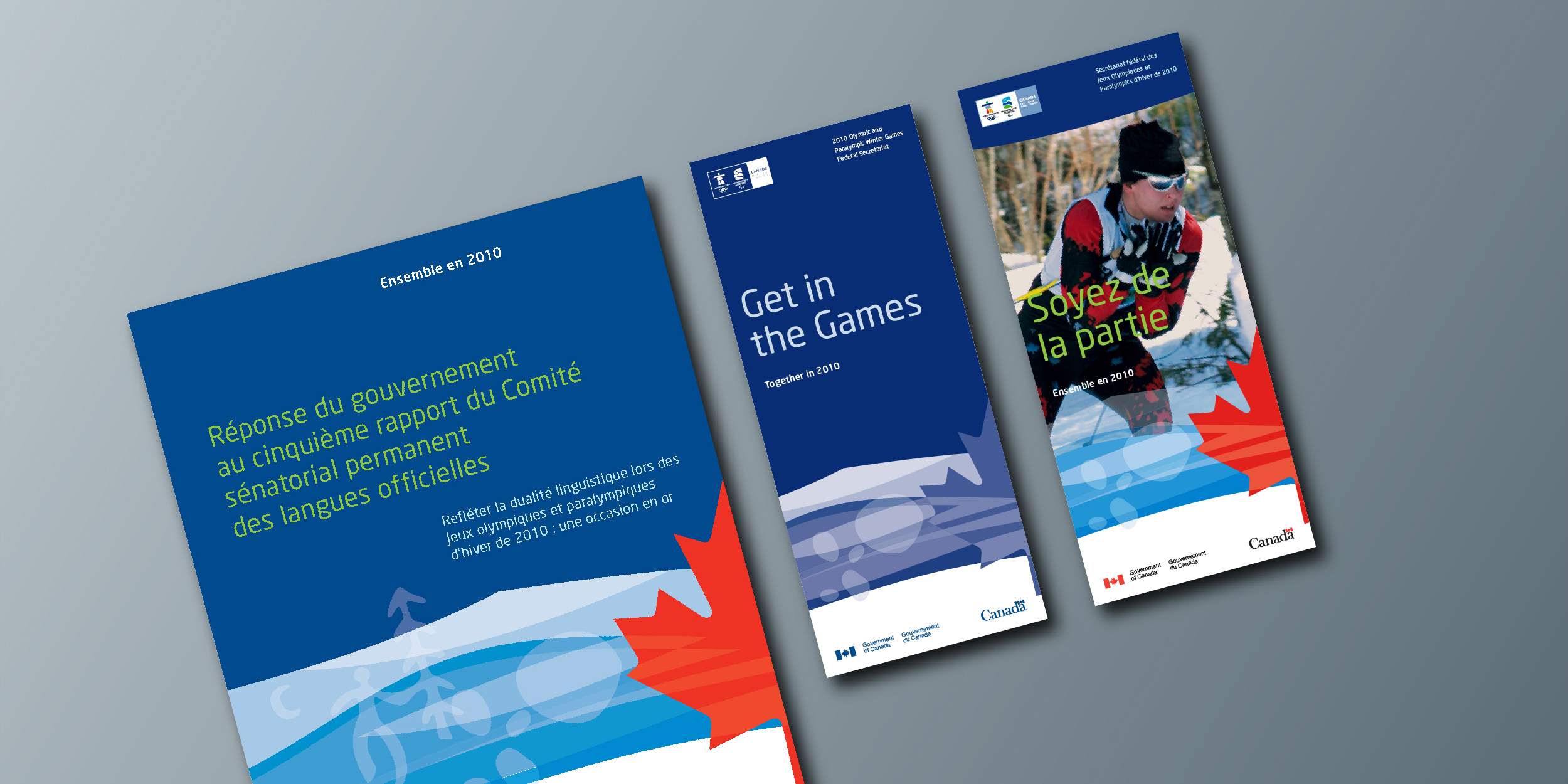
Creating a unified voice for Canada
Capabilities applied- Brand audit
- Identity design
- Identity standards
- Implementation
The situation
As host country for the 2010 Olympic and Paralympic Winter Games, held in Vancouver, B.C., the Government of Canada decided to put forward a consistent and distinctive look for all its communication products and initiatives. The look had to articulate the Government’s vision for the Games, and was to be used by over 32 Government departments and agencies. Part of the challenge of this engagement was that the design had to comply with both the Federal Identity Program (FIP) elements, as well as the Vancouver 2010 emblems and graphic standards.

Our actions
Integral to the project’s success was a well-planned and thought-out “kit of parts” that allowed for the selective application of various branding elements to different media while creating a unified voice. This approach was selected to help ease its use by the many outside design and advertising agencies that were to implement the Government’s vast communications materials for the Games.
The branding system was applicable to materials as varied as stationery, fact sheets, kit folders, brochures of different formats, sizes and languages; signs and banners; vehicles; electronic media from web sites, television, film and video to new media such as podcasts and mobile phone content; advertising media; promotional give-away items such as magnets, buttons, pins, shirts, other clothing items, hockey pucks, etc.
Separate English and French graphic standards manuals were issued as navigable PDF documents, containing a comprehensive catalogue of all relevant artwork files with descriptions, file formats and primary use reference. The Graphic Standards Guide also discussed the “Canada 2010 Brand” in the context of how the new corporate look had to adhere to all Federal Identity Program (FIP) regulations.
The results
The Canada 2010 brand was fully rolled out by many agencies across Canada. Due to the successful deployment of the Canada 2010 intranet site and the clear, concise nature of the Graphic Standards Guide, all file formats and design suggestions were employed successfully.


