A caring brand takes flight
Capabilities applied- Brand architecture
- Brand audit
- Identity design
- Identity standards
- Implementation
The situation
In January 2006, Ontario Air Ambulance (OAA) was appointed by the Ontario Ministry of Health and Long Term Care to coordinate all aspects of the province’s transport medicine system. OAA recognized the need to have a compelling brand identity that was compatible with all aspects of its increasing responsibilities.

Our actions
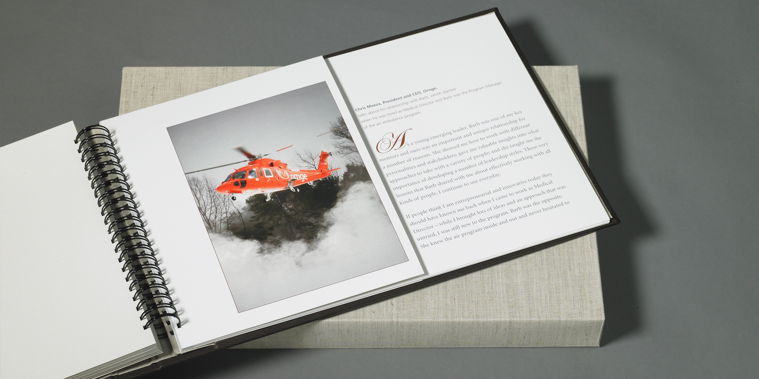
New brand identity concepts were developed for several supplied new name options for the organization. Presenting to the brand champions (a group with representation from head office, operations, paramedics and key executives, including the president), options for the new name and brand identity were reviewed and narrowed down over several meetings. Ultimately the final brand identity was selected. It was immediately apparent, given the general public’s association of orange-coloured helicopters with air ambulances, that the new brand identity’s dominant colour would be orange. It also determined the organization’s new name. The brand champions were regularly consulted over the course of establishing the visual platform of the brand. Implementation of the new brand identity involved a smaller internal team, reviewing and approving designs for rebranding the fleet of helicopters and fixed wing aircraft, stationery, uniforms, signage, promotional items and brand identity guidelines.
The results
Ornge was successfully launched, initially to employees and then to external stakeholders, in August 2006. Employees quickly embraced the new brand identity, especially the symbol, which one manager has dubbed “the wings of transportation, the hands of care.”


