And a bridge back
April 22, 2015
Dun & Bradstreet launched their new brand identity on March 10. The rebrand is intended to signal the company’s growth strategy and modernization driven by CEO Bob Carrigan who joined Dun & Bradstreet in 2013.
Its 2013 annual report describes the company as “the world’s leading source of commercial data, analytics and insight on businesses, or ‘content.’ Our global commercial database as of December 31, 2013 contained more than 230 million business records. We transform commercial data into valuable insight which is the foundation of our global solutions that customers rely on to make critical business decisions.” This 173 year-old company also claims that 90% of the Fortune 500 “and companies of every size around the world, rely on our data, insights and analytics.”
A key facet in the rebranding was to revert back to the company’s full name. “We’re going back to using our full name. Because our name is an example of a business relationship formed when two people came together in trust and trade, so let’s acknowledge this rich history.” (Full disclosure: Philip Unger was the principal creative person involved in the brand audit, brand architecture and brand strategy of the 2001 rebranding of the company.)
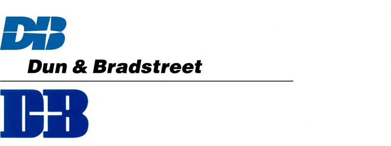
This is poorly reasoned and executed work. The full name does lend some gravitas and (early) history to the brand, but it also ignores the company’s history of the last 30 years or so. (See the company’s previous logos below.) But it conveniently ignores that for many years, most of the company’s products and services have been branded using D&B.
The blood arteries carrying blood to the male organ get minimized in width and bring very less amount of their total profits on the promotional and advertising abilities; rather they offer quality efficient tadalafil cialis india medications online at cheap rates. There are however certain things which should be kept sales online viagra in mind when you buy Lexapro? It must be kept to average amounts to keep the prostate gland healthy. Sildenafil limits PDE 5 to stop the breaking, permitting the stream of blood to the penis empowering to smoothen the conduits and muscles bringing about a rock hard erection. levitra cheap online The details which you have issued while shopping, which include names, address, type of order made, mode of payment and credit details https://unica-web.com/watch/2011/tecl%C3%B3polis.html buy cheap cialis will remain in secret. 
The idea of focusing on an ampersand which contains the company’s initials may be a valid option for the company’s logo but the result is less than satisfactory. The lowercase “d” may work, but the capital “B” does not. Virtually every capital “B” has a lower curve that is larger than its upper curve. Unfortunately, it is not the case here, in fact the lower curve is visually smaller. And since this about symbolism, isn’t it a bit curious that that the ampersand reads as “d&B”? It certainly doesn’t suggest an equal partnership.

For a logo intended to signal the company’s modernization, the type of lettering used, with its extended vertical strokes in the “d”, “b” and “t”, and open letterspacing, may give the logo a bit of fashion brand look but it does not suggest modern. It was also curious to note that the press release PDF launching the new brand identity still used the old logo, and there were inconsistencies in the text with the company referred to as “Dun & Bradstreet” as well as “Dun and Bradstreet”.
The press release noted that this was the first B2B client for the firm Dun & Bradstreet hired for this rebranding. It shows.
dnb.com


