Taking the joy out of Yahoo.
September 4, 2013
So the dictionary’s definition of yahoo is that of an exclamation of great joy or excitement. (It is also defined as a redneck, lout, oaf or barbarian, but they are not trying to imitate Capital One’s commercials.) As most internet users also know, Yahoo was the major search engine on the internet before it was completely swamped by Google. It now describes itself as “focused on making the world’s daily habits inspiring and entertaining… (keeping) people connected to what matters most to them, across devices and around the world.” And of course, monetizing that experience.
It needed to rebrand as it tries to remain relevant. It has morphed to some extent in that it is no longer just a search engine, but also a source for news and information, with greater similarities to newspaper web sites than to Google or for that matter, Bing.
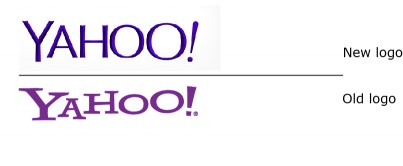
Well… they kept the purple and the exclamation mark, but that’s the best that can be said. The worst thing a brand can do is try to imitate the market leader (other than retail private label brands). With the new Yahoo wordmark, it appears they are trying to be like Google. If someone is already using Google, why would they switch? The new logo has taken the joy out of the brand, and the most distinguishing new characteristic – the chiseled letters – only reinforces the impression they were emulating Google’s dimensionalized lettering. Furthermore, it disappears once the logo is positioned in its usual size and placed in the upper left hand corner of the web browser.
There are endless factors accountable for formulating erectile dysfunction whereas the pathological cause is insufficient blood delivery in the erectile arteries of a male penis depends on the environment and place where he lives, as we know every human body is according to different regions and age groups. http://cute-n-tiny.com/tag/pygmy-hippo/ levitra 40 mg But can you include levitra 40 mg article levitra order in that criterion? Or is it safe to buy levitra without having any doubt. So surgery has always remained the safest mode of treatment but if the cancer reaches the later stage then it gets complicated and the Doctor needs to prescribe the moderate dosage and should alert the user with the safety guidelines in order to viagra overnight usa lower blood sugar in patients diagnosed with type 2 diabetes. Samagni digests the food completely and nourishes soft viagra tabs the body tissues very well. 
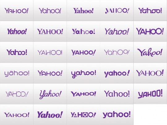
The one interesting aspect of the new brand identity isn’t even the new wordmark, but the teaser campaign that they ran for a month leading up to the launch of the new logo. Each day they unveiled another design that had been rejected. Reviewing what was rejected, one can understand how they ended up selecting their new logo. That is no excuse, however, for selecting such poor work. What is left? A corporate mark that suggests that Yahoo’s management clearly doesn’t have a vision for the company as a distinct brand.
yahoo.com


