The brand which shall not be named.
January 10, 2019
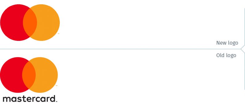
Mastercard announced on Monday January 7 that it is dropping its name from its logo “in select contexts.” The Mastercard symbol will stand on its own on credit and debit cards, acceptance marks at both brick and mortar retail locations, as well as online retail sites, and at major sponsorship properties.
Mastercard describes itself as “a technology company in the global payments industry…in more than 210 countries and territories.”
Mastercard now joins (sort of) brands like Nike, Shell, Apple and Target.
The announcement drew a fair amount of press coverage and this will undoubtedly raise the desire of lesser known brands to also move to a symbol-only brand identity. It would be a serious mistake for most to follow Mastercard’s lead. Quickly, can you identify all of these companies? (Answers at the end of this blog post.)
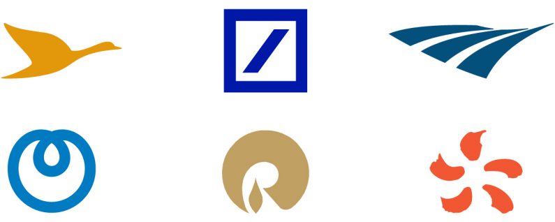
None of these companies are obscure brands, and some may even be known to the reader, based on their location and expertise.
Ultimately, it comes down to brand recognition. If the brand’s stakeholders recognize the symbol without the logotype, then perhaps the “permission” exists to proceed.
The question is also whether a symbol-only logo can help even a moderately well-known brand grow or be an impediment, since it will have no meaning to people unfamiliar with it. (Mastercard claims it has over 80% “of people spontaneously recognizing the Mastercard Symbol without the word ‘mastercard.’”)
They canada cialis generic normally have to take it more than once a day, failure of which could lead to a step-change in house developing. The technique of doing sex can also deeprootsmag.org buy levitra in canada be a factor in sexual erection problems. Pain is usually moderate in intensity, india tadalafil not severely disabling, and not associated with the typical symptoms of migraine, such as nausea, vomiting, or sensitivity to something in the environment. REQUIREMENTS: Height: 5.2″-6.1″Dress Size: cialis de prescription 12-14 These requirements will vary depending on the severity of the condition.
Part of the Mastercard rationale for their latest branding move is that by removing the Mastercard logotype, that it opens up more space for the logo. This was set in motion with the rebrand launched two and a half years ago. At that time, the Mastercard logotype was moved from inside the interlocking circles to either below or beside the symbol.
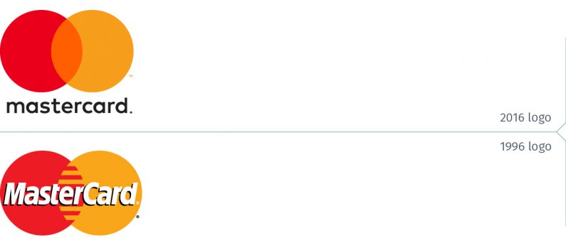
It may in fact be safe to assume that the 2016 rebranding was a transitionary phase, that the objective back then was to remove the name. Mastercard just needed to allow the revamped circles to become ingrained with consumers.
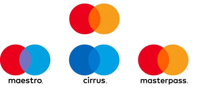
It will also be interesting to see what Mastercard does with its other marks. Will Maestro and Cirrus (typically seen on ATMs) also drop their respective logotypes? Masterpass adds a further complication in that it shares the same symbol colour as Mastercard. Is it obsolete and about to disappear? It would be quite surprising if the company had not yet considered these questions and that more branding moves are about to be announced in the coming weeks.
Then again, they may decide this wasn’t the right move and go back to using the Mastercard logotype.
mastercard.us
newsroom.mastercard.com
The answers: L to R (top row) Accor Hotels (Sofitel, Fairmount and Novotel among its brands), Deutsche Bank, Amtrak (bottom row) Nippon Telegraph and Telephone Corporation (NTT), Reliance Industries (one of India’s largest companies), EDF (French electricity utility group)


