“The mind sees what it chooses to see.”
December 14, 2022
![]()
As the year draws to an end, a new brand identity that was highlighted nearly two years ago has attracted a fair amount of attention over the past few weeks. Do you trust your eyes?
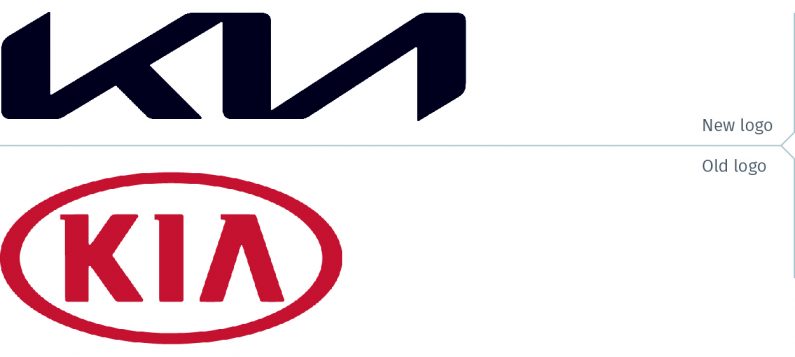
Kia unveiled its new brand identity with a new wordmark on January 6, 2021. The initial online reaction was fairly positive, with comments stating that the futuristic logo was fit for the times as automobile companies race to convert their fleets to electric vehicles.
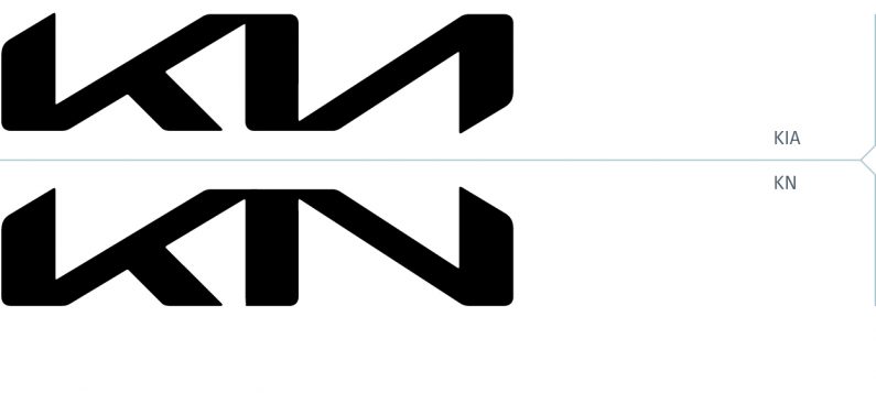
Then about three weeks ago, a tweet claimed that shortly after the logo began appearing on vehicles in March 2021, there were 30,000 Google searches a month for “KN car”. Some reports about this tweet claimed it was 30,000 in the United States. Or was it 30,000 worldwide?
the new kia logo is so unreadable that at least 30k people a month search for the "KN car" ever since its debut pic.twitter.com/jRj25JoAPp
— Ashwinn (@Shwinnabego) November 17, 2022
There was no context provided with this number, so it is impossible to say whether that figure is of any consequence. For example, if 30,000 is less than 10% of total searches for “Kia”, it’s not much of a problem. Any search results for “KN car” leads a person to Kia anyway.
It also wouldn’t be surprising if there’s been an uptick in the past two to three weeks in searches for “KN car” as a result of the news stories about this. If some people are confused and rather than seeing the letters K, I, A, they see KN, this is a transitional issue after launching a new logo. It will probably dissipate as people become educated and are accustomed to seeing it. But does it really look like KN? Not if the logo is modified so that it really is both a K and an N.
Some online commentators suggested that Kia “fix” the logo by either separating the letters or adding a horizontal bar to the A. They also quickly added that they are not designers. As shown below, the results would be less than satisfactory.

Maybe there are so many Russian-reading people in the United States that 30,000 per month were confused and thought the logo was in Cyrillic lettering. But then they would have searched for KH, since that is how KИ reads.

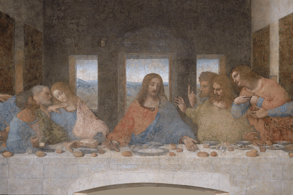
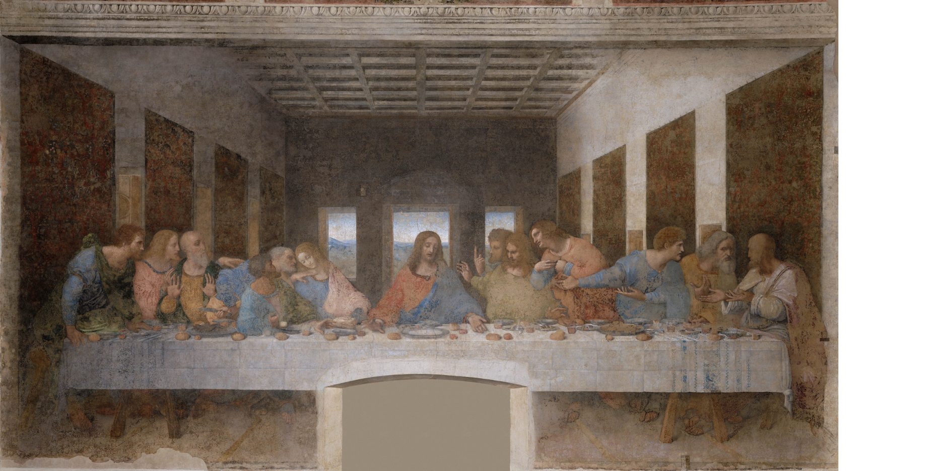
The term scotoma is raised in a pivotal scene of Dan Brown’s The Da Vinci Code. Robert Langdon and Sophie Neveu seek out Sir Leigh Teabing at his residence, Chateau Villete. Teabing explains the origin of the Holy Grail and reveals its identity in Da Vinci’s The Last Supper mural. In the movie version of the novel, scotoma is defined as, “The mind sees what it chooses to see.”
(Image source: Wikipedia)
In the novel, Teabing points to The Last Supper and suggests that “if you view Jesus and Magdalene (the figure to the left of Jesus) as compositional elements rather than people, you will see another obvious shape leap out at you…”: the letter M.

Did Da Vinci really intend to create the letter M, or was he merely using standard compositional diagonal elements to draw the eye to the centre of the mural, the depiction of Jesus sitting in the middle? Without being a Da Vinci historian, one is probably safe to assume the latter, and not the letter. And kudos to Dan Brown for creating the illusion of a hidden letter in Da Vinci’s masterpiece.
Changing the Kia logo to accommodate some people who are misreading it is not a reasonable solution. And surely none of Da Vinci’s contemporaries suggested that he repaint one of the disciples to look less feminine because someone may be confused, or that 500 years later, an author may write a novel based on the assumption that the person depicted next to Jesus was a woman.
Some people keep looking for hidden messages in The Last Supper. Who knows, maybe they will find KIA hidden somewhere in the mural. “The mind sees what it chooses to see.”