A midsummer’s letter of letters
July 25, 2022
Photo: iStock.com/Alex Potemkin
A few large organizations have recently rebranded, and all have opted for wordmarks, that is, logos consisting solely of letters.
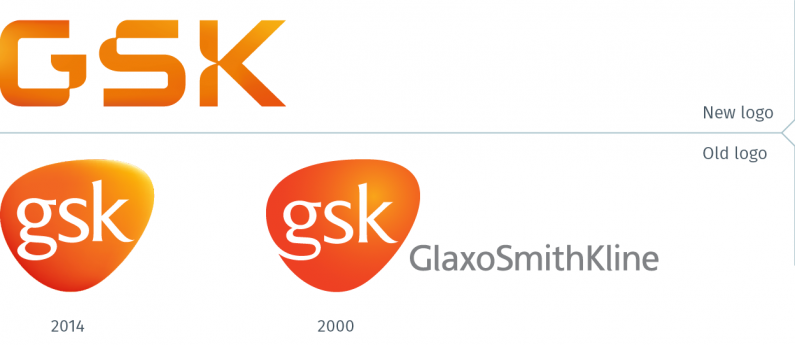
GSK, formerly known as GloxoSmithKline, has rebranded, as a result of the demerger of its consumer-facing brands division. The new GSK logo is a wordmark of heavily stylized characters, having abandoned its rounded triangular logo first launched in 2000 and updated in 2014. (Full disclosure: When Philip worked in FutureBrand’s New York office, he contributed logo concepts for the 2000 rebrand which was executed by the London office). All the twists and tweaks in the GSK characters are all deliberate, symbolizing, for instance, a DNA double helix. The wordmark has retained the orange colour, but one wishes they had opted for the punchier orange from the 2000 logo. Overall, this is a courageous attempt at having a distinct logo, and a pleasant departure from so many rebranding efforts recently that just try to blend in with all the other logos in their business sector.
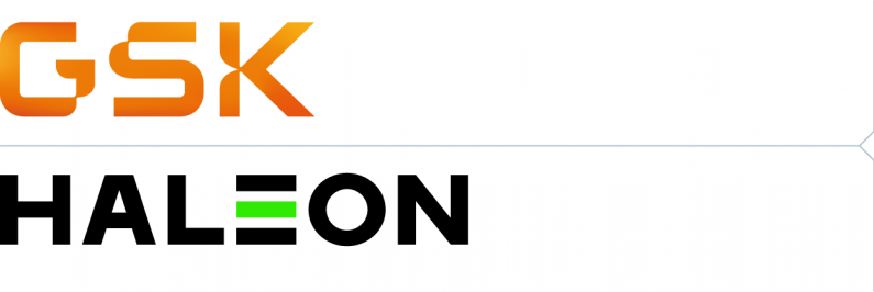
The new, demerged company naturally also needed a new name and brand identity. The company, Haleon, has a large portfolio of brands, including Advil, Centrum, Excedrin, Tums, Theraflu, and Polident. Haleon’s logo is also a wordmark, but compared to GSK, it looks like the poor cousin. It’s as if Haleon (or GSK before they cast it adrift) decided that as the parent of a portfolio of well-known brands, it did not require much of a logo. If that was indeed the thinking, it was a mistake.
The logos of most of the best-known consumer brand corporations are not as generic-looking. Whether they are strictly consumer brand companies such as P&G or Unilever, or a global pharmaceutical company offering both medicines and over-the-counter products, companies today understand that they cannot afford to be invisible to their stakeholders.
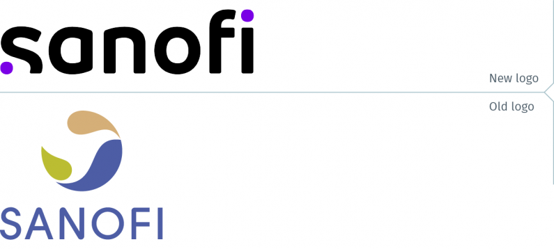
Another global pharmaceutical company, Sanofi, also rebranded some months ago and they also opted for a wordmark as their logo. This is another interesting logo, and quite different from the GSK logo. The truncated “s” with the purple dot balances with the dot on the “i”. For a global company with its headquarters in Paris, this logo somehow also manages to exude a European sensibility.
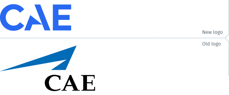
CAE, A Montreal-based global company best known for its flight simulators, unveiled its new brand identity and logo earlier this month. They have also opted for a wordmark, dropping their chevron symbol. Instead, the letter A has been modified to carry forward the brand equity of the former symbol. With a brighter, more vibrant blue, and a clean, sans-serif typestyle, the result is a simple, modern logo.
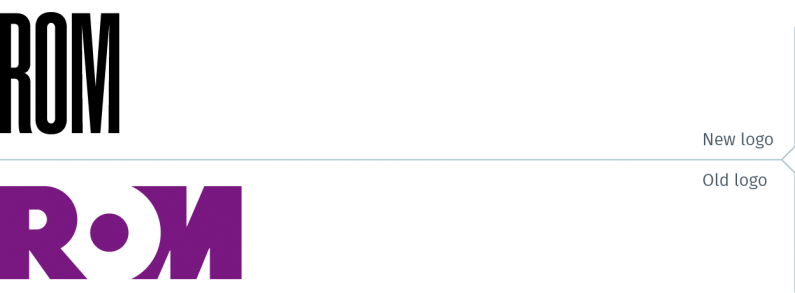
Finally, the Royal Ontario Museum (ROM) has rebranded. Located in Toronto, ROM claims to be one of the top ten cultural institutions in North America, with a large collection of artwork, cultural objects and natural history specimens. With an eye to apparently projecting a more modern image, they have replaced their former wordmark with an ultra-condensed typestyle in black. The new logo appears to be more like an ill-fated fashion brand than a museum logo. In the press release announcing the rebrand, ROM’s Director and CEO was quoted as stating, “Now, more than ever, people are looking for new ways of understanding, and new ways of connecting with their community…” That statement is totally understandable, considering the museum is steps away from the tony Yorkville neighbourhood with boutiques offering the latest fashions from New York, Paris and Milan. While they may be part of the same community, ROM, a museum with dinosaur skeletons, is not in the business of selling $8,000 handbags or $5,000 suits.
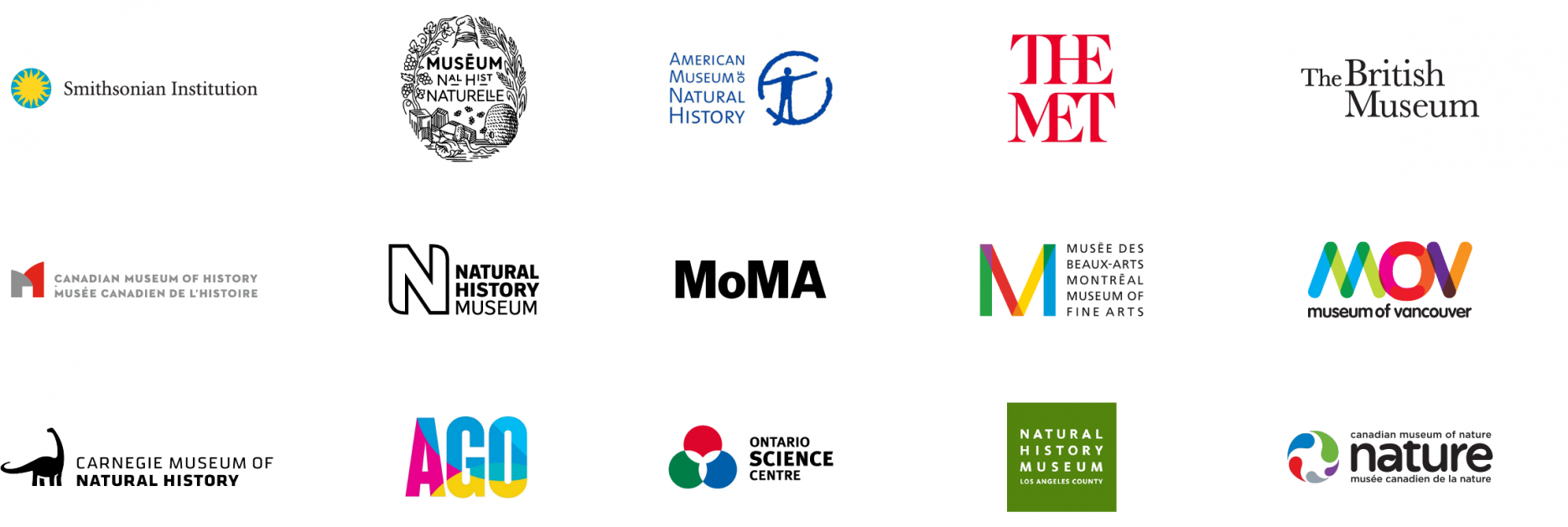
Other museums have a variety of types of logos, but other institutions have simple wordmarks that are perfectly capable of communicating something about who they are, rather than imitating the generic appearance that many fashion brands have decided to adopt the last couple of years. It may be that ROM directors have spent too many hours with their faces pressed against the boutique windows.
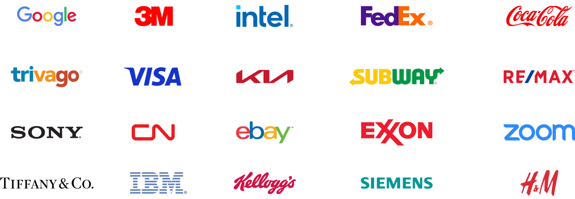
Many companies feel the need to have a symbol, an icon – a “thing” – that they can proudly point to as their flag. That’s perfectly understandable. This was part of the point of the previous blog post (click here to read it). Notwithstanding a couple of substandard examples above, wordmarks can be a strong and effective means to brand an organization. A quick survey of some of the world’s strongest brands reveals that many have wordmark logos. Their logos are among those that have been the most enduring; others are among the best designed. These companies, from Google to FedEx, can’t all be wrong.