Are you ready for your close-up?
December 12, 2023
Several significant companies have rebranded over the past few months, including Deezer, Johnson & Johnson, AtkinsRéalis and Air India. One thing in common that all these rebrands have is that they posted videos and/or television commercials touting their new brand identities. Videos are a compelling vehicle to communicate with a brand’s key stakeholders. This blog post looks at how they all took different approaches.
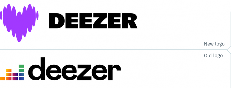
Paris-based Deezer rebranded last month. The music streaming company describes itself as “one of the world’s largest independent music experiences platforms.” The new logo is vastly superior to its previous mark. The heart-shaped logo made of sound waves is a fresh take for a music streaming app. The launch video is a heartfelt (pardon the pun) communications vehicle. With its slightly odd-ball looking cast, it conveys the CEO’s message “Love for music, and helping people be and belong through music…”
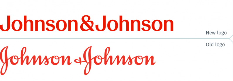
Johnson and Johnson has also rebranded, after spinning off its consumer products as a new company, Kenvue. The new J&J is now a company focused on both its medtech and pharmaceutical segments. They ditched their 130-year-old script logo in favour of a generic wordmark, yet retained red as their brand colour. Various reports also assumed that the new wordmark was adopted to distance the company from multiple lawsuits alleging that its Johnson & Johnson baby powder caused cancer. The new logo, apart from being red, is a fairly dull mark. Predictably, the company’s launch television commercial is also uninspiring. This could have been produced for any other pharma brand; the logo at the end would just have to change.
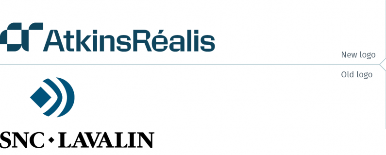
The giant Montreal-based engineering firm SNC Lavalin, another company attempting to move beyond its troubled past, has rebranded, adopting AtkinsRéalis as its new name. With a new name and brand, they are clearly trying to place behind them the accusations that the firm bribed Libyan government officials between 2100 and 2011 to the tune of $48 million. The new name is a bit odd: a combination of Atkins, the name of a subsidiary and Réalis “inspired by the city of Montréal.” On the other hand, their launch video is well done, using tried and true tactics. The video employs well-filmed segments from around the world, identifying both locations and employees. Featuring the latter is highly effective in both lending a human face to the company for external audiences, as well as gaining buy-in for the new brand from employees. As the video was doubtlessly shared internally at the brand launch, seeing colleagues, even for a fleeting moment, creates a real link to the new brand for employees. When such a video is shown at an internal brand launch event it is not unusual to witness cheers coming from friends and colleagues of the individuals included in the video.
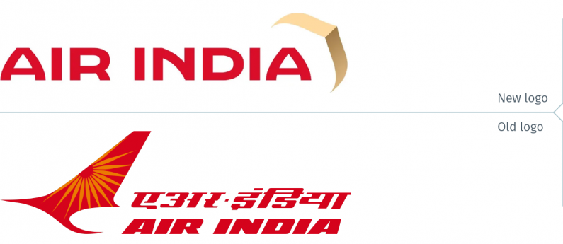
Tata-owned Air India recently rebranded. The airline now has a contemporary brand identity with a modern-looking logo including a symbol that is based on an Indian window shape. Even the logotype draws inspiration from traditional Indian shapes, notably the As and the N. In the charming launch video, the idea of the window becomes a portal through which a young girl in the countryside imagines another, more colourful world, full of new possibilities.
Watching this video, it was impossible not to think of another company’s television commercial. When Canada’s CIBC rebranded, they launched their new brand with this TV spot.
Did Air India copy the CIBC commercial or is this a coincidence? Could an advertising agency in (one assumes) Mumbai be aware of the ad issued by a Canadian bank? Was this intentional? Did the client draw the agency’s attention to the CIBC spot, and demand, “I want ours to be just like this one”? This is not an unusual occurrence; some clients are known to have asked for their version of someone else’s creative output. Or is this a case where the agency took it upon themselves to copy another’s work? This is impossible to know. What is clear is that there are just too many similarities between the two to assume it’s happenstance.
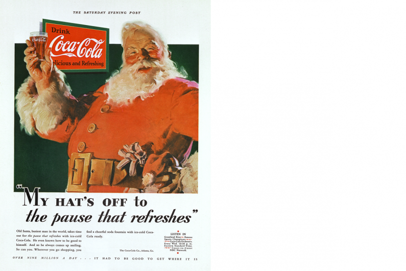
Finally, considering the time of year this blog is being published, this is an opportune time to draw attention to brands that commission holiday television commercials that, rather than shilling for end-of-year sales, communicate a softer message, often meant to give the brand a more human face. Coca-Cola is, of course, the most notable of these brands. After all, it was a Coke print ad in 1931, with an illustration by Haddon Sundblom that gave Santa Claus its current persona. Before that illustration, Santa was depicted in different shapes and sizes, with different colour outfits. Sundblom’s illustration of Santa in a red suit as a fat, jolly man is how he is now portrayed in illustrations, photos and films, as well as the Santa Clauses in hundreds (thousands?) of shopping malls the world over.
In more recent years, Coca-Cola created a series of polar bear commercials that became iconic spots, and caught everyone’s imagination, delighting viewers. This year’s commercial focused on Santa Claus, and while it’s charming, it is not as successful as those polar bear ads.
One stand-out holiday commercial this season is the one from Amazon. It is warm, gently funny and tugs at the heartstrings with an original and unexpected storyline. Plus, with an instrumental version of a Beatles song, how could it possibly not be good? All this proves that if a picture is said to be worth a thousand words, then a well-crafted video may be worth a million.