Love to Hate
April 20, 2023
Brand launches most often elicit venom from online haters. The recent unveiling of a few rebranding initiatives illustrated that a thick skin is required for organizations that are unveiling their new brand identities.
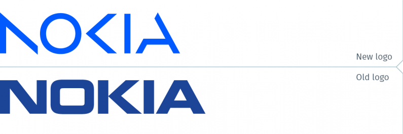
Nokia unveiled its new brand identity on February 26 at the Mobile World Congress in Barcelona. This Finnish telecommunications equipment giant rebranded to underscore it was no longer producing mobile phone handsets. It didn’t take long for the online haters to post comments comparing the new Nokia wordmark to the Kia logo, with its supposedly illegible characters. This is all nonsense, of course. Whatever can be said about the Kia logo (read our previous blog post about Kia here), the Nokia logo is easily read and is a definite improvement over the previous chunky logo. The new logo, with its lighter character weight and brighter blue, is a more appropriate mark for a leading technology brand in the 21st century.
A logo is not text. It is a mark, a signature, and it should be regarded as such. No one argues that the CBS “eye” isn’t an accurate depiction of an eye. No one has ever argued that the Starbucks mermaid does not resemble actual mermaids (though if someone were to stake out that position, it would be fascinating to know the information that argument was based on). So hats off to Nokia for a successful rebrand.
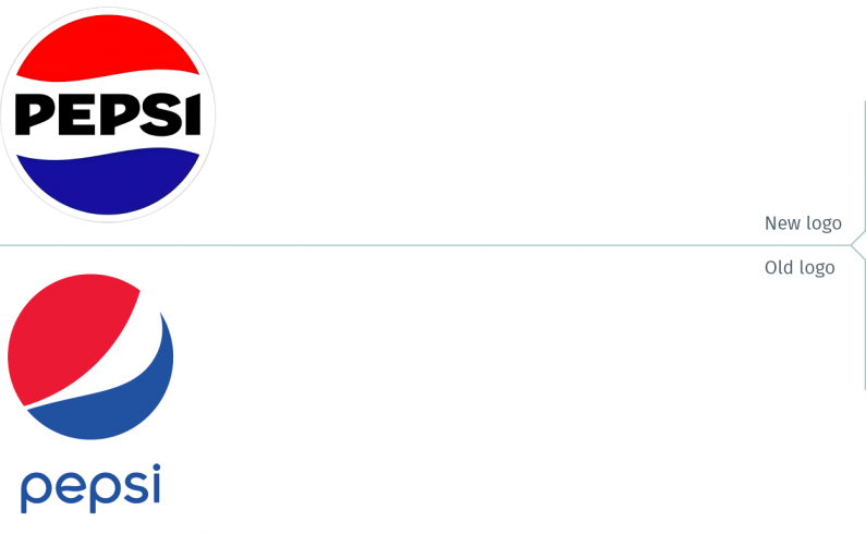
A month later, late in March, Pepsico announced it is rebranding Pepsi. North America will first see the new packaging this fall, coinciding with the brand’s 125th anniversary. The company also announced that the new branding will be rolled out globally in 2024. The new logo takes Pepsi back to its iconic branding that evolved over several iterations, from 1962 to 1991. This new Pepsi logo, introduced 9 years after the launch of its previous logo, is also emblematic of an issue that has plagued Pepsi since its first days: it can’t help itself from changing logos every few years. Some of their logos barely lasted 3 years.

Still, this new version of the Pepsi logo was well received with not much criticism from social media. Maybe the reason was that the logo released in 2008 was met with much derision for a supercilious brand rationale that compared the logo to the Parthenon, the Mona Lisa, the earth’s magnetic fields, and the expansion of the universe (really!), among other things.
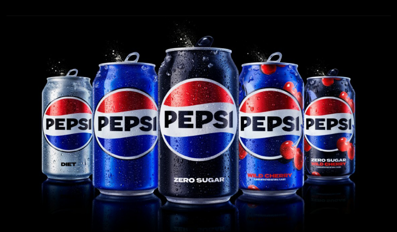
The images released by Pepsi are focused on the brand’s Zero Sugar flavour, instead of the expected “regular” Pepsi. One of the only quibbles one might have with this new iteration of the Pepsi logo is that the logotype is black. The overall look would have been a bit more refined with the dark blue from the Zero Sugar cans as the logotype colour.
pepsico.com
pepsi.com
pepsi.ca
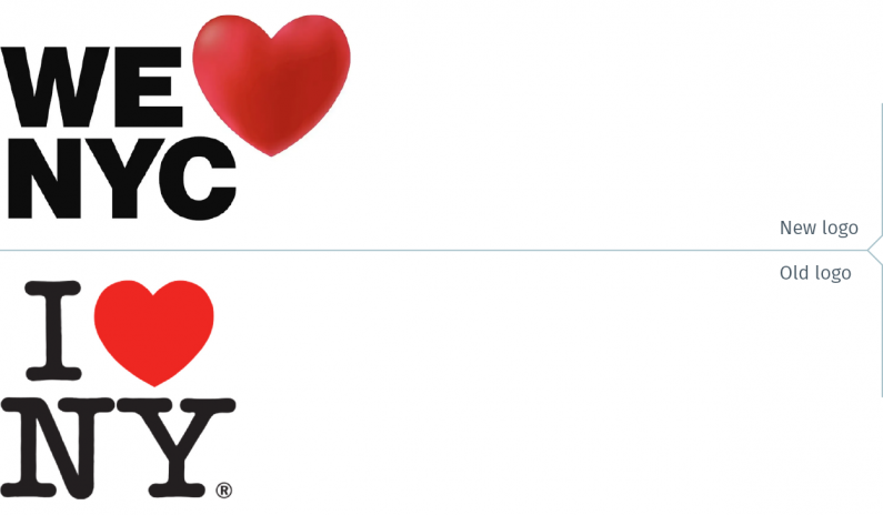
Finally, a new “I Love NYC” was also unveiled this past month, a new take on the iconic Milton Glaser logo created in 1977. The original logo was created to represent all of New York State, not just the city. You know you have hit a nerve when a new logo elicits articles in the New York Times and the New Yorker. Most of the reaction has been positively negative; the Times quotes one person as stating, “If there’s going to be a riot in NYC, it’ll be over this.” Subtle is definitely not a word one would use to describe the sentiments expressed.
The original Glaser logo is all the more remarkable considering it was designed decades before emojis, emoticons, and all these modern hieroglyphics became ubiquitous. That logo has generated many different imitations since, including a sign recently erected in front of a private French school in Toronto.
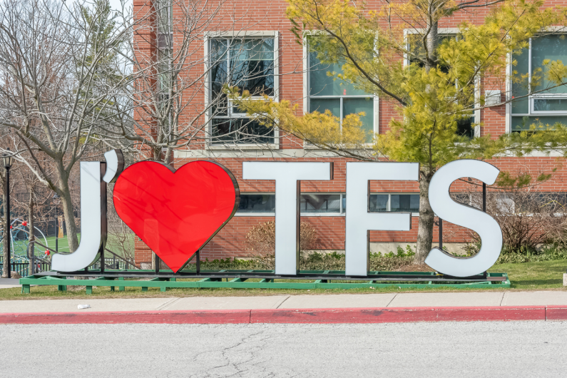
Photograph @ Eli Unger 2023
That a “We Love NYC” logo was created does not make sense. To begin with, New York State still uses a horizontal version of the original logo. That single fact should have pushed the designers to find another direction for the new logo. If they had at least used the same typeface, the same heart, the same proportions as the original, and not replaced “I” with “We”, it would have been seen as a sub-brand. They just may have found that an acceptable solution.
It’s obvious that by changing the look of the beloved Milton Glaser logo with a different type style – under the pretext that it reflects the signage of the New York City subway – and with a different heart icon, the new logo would be met with scorn. They would have been better off striking in a totally different direction with something that was creative and evocative. Oh, to dream an impossible dream.
What are the takeaways from these three rebranding efforts? There are a few simple ones.
• Create a new, creative brand identity, one that is grounded in solid research, with a deep understanding of the brand’s stakeholders.
• People are resistant to change, and a company must be ready to explain the rationale for the new brand, in clear, unpretentious language.
• No matter what is done to avoid it, if the brand has a high profile with the general public, be prepared for negative social media. Haters will hate.
I Love NY
Partnership for New York City
We love NYC
New York Times Story