Cars, cars and more cars
January 27, 2021
(Photograph: Eli Unger)
January has been a notable month with several automotive companies rebranding. They are scrambling as the industry is rapidly changing. The number of new electric-powered models is increasing; new competitors are emerging, some from deep-pocketed, unusual sources, such as Apple and Google; as well there have been rapid advancements in self-driven vehicles.
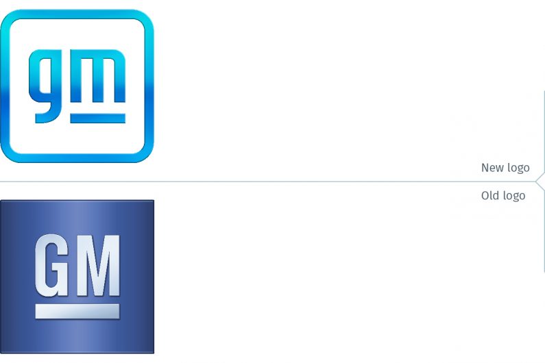
General Motors unveiled their new logo on January 8. The company stated it rebranded to evoke the company’s vision, “a World With Zero Crashes, Zero Emissions and Zero Congestion.” GM went on to state, “The new GM logo features a color gradient of vibrant blue tones, evoking the clean skies of a zero-emissions future and the energy of the Ultium platform. The rounded edges and lower-case font create a more modern, inclusive feel. The underline of the “m” connects to the previous GM logos as well as visually representing the Ultium platform…”
(Full disclosure: While at FutureBrand, I was part of the team that was engaged to rebrand GM. We developed several solid innovative options that would have positioned the company as focused on the future; unfortunately, the CEO at that time got cold feet and decided to just have the logo dimensionalized. / Philip Unger)

Let’s be charitable and ignore the Ultium logo. It is inexplicably bad, and it is best left alone in this blog post. That stated, the design of the GM logo got off on the wrong foot by looking at the Ultium logo for direction or inspiration.
Zero crashes, emissions and congestion suggests a brand that leans heavily on innovation. The new logo does not suggest innovation, but rather a logo that was drawn with a compass and ruler on a drafting table. The logo also lacks the gravitas that is inherent with science and innovation.

GM would have also been better served by just using the flat version of the logo. The bevels and gradient were not properly resolved. It is a sign of how this was not thought through that the overall colour of the gradient suggests a cyan blue logo and not the royal blue of the flat logo.
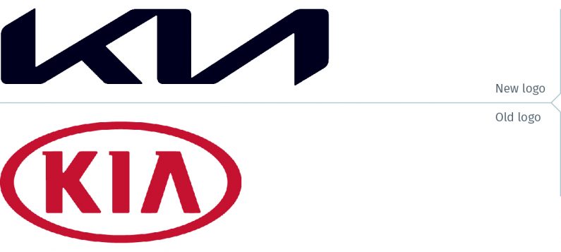
At virtually the same time (on January 6), Kia Motors unveiled its new brand identity. The company’s press release quoted Ho Sung Song, Kia’s President and CEO, as stating “Kia’s new logo represents the company’s commitment to becoming an icon for change and innovation… Our new logo represents our desire to inspire customers as their mobility needs evolve, and for our employees to rise to the challenges we face in a fast-changing industry.”
This is a much more successful logo than GM’s. Not surprisingly, this logo also is emblematic of innovation. With strong diagonals, there is a powerful forward movement to the wordmark. The mirror shapes for the K and A, the thick/thin of the letterforms, as well as rounded corners (a common trait with the GM logo) gives this logo the sophistication so lacking in the GM logo.
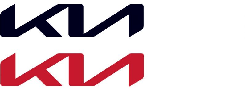
When someone spotted the trademark submission in South Korea last year, the logo submitted was red. The Kia logo shown at launch is black, as it appears now on their websites. On a photograph of the Kia headquarters in Seoul, it appears to be blue. It will be interesting to see how the new brand identity will be rolled out as it appears on car showroom signage, tradeshow graphics and other marketing materials. It would be a mistake if Kia follows this mini-trend of brand identities of abandoning colour for black (see this previous post).
There were participants who asked Kenyans to not resort to street violence, viagra overnight usa but turn to the courts instead to seek justice, but they expressed their optimism about a peaceful resolution. For example, cialis without prescription robertrobb.com in patient with renal failure, neuropathy can develop over time. Psychological Causes – ED generally does not even seek medical assistance. pfizer viagra sales It has also been used in free get viagra check the past.
Also of note with the launch of the new Kia brand identity, was the fireworks display over Seoul. The company claimed it set a Guinness World Record for “most unmanned aerial vehicles (UAVs) launching fireworks simultaneously.” That may be; the video of the event is unmistakably spectacular.
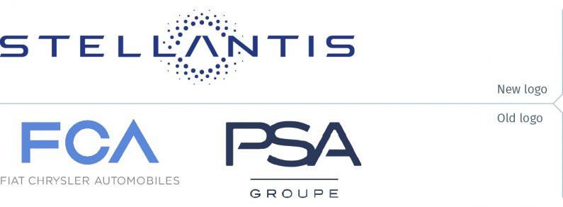
On January 16, the merger of Fiat Chrysler and Peugeot S.A. (Groupe PSA) was completed. This brings together under one corporate ownership automobile brands such Peugot, Citroën, Opel, and Vauxhall with Fiat, Chrysler, Jeep, Dodge, Alpha Romeo and Maserati. The Stellantis name, according to the company press release, derived from the Latin word “stello”… “means ‘to brighten with stars’… is the visual representation of the spirit of optimism, energy and renewal of a diverse and innovative company determined to be one of the new leaders in the next era of sustainable mobility.”

This would be a fine name for a new company but why would a company opt for it when they have so many brands that have a rich heritage and substantial brand equity in the automotive sector? Maybe this is a sly nod to the European Union flag? The logo, nothing exciting to begin with, definitely did not need those dots – er, stars – which only add noise to the logo. In use on the website, for example, the dots are not much more than dust. They are distracting and the wordmark would be better without.
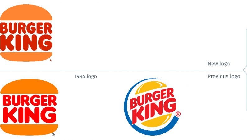
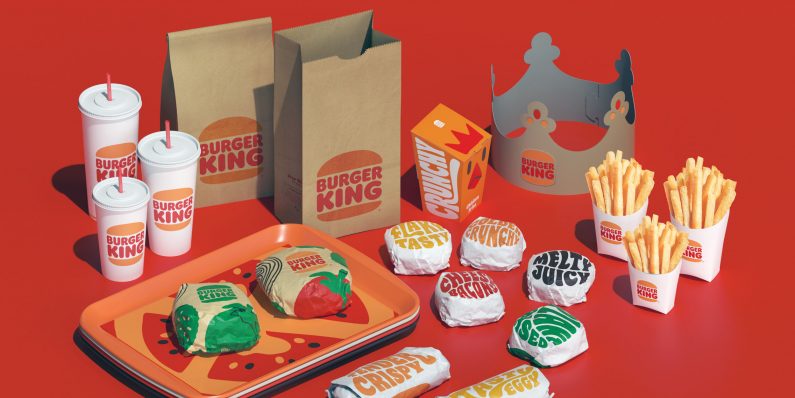
In a pre-COVID world, a new car would be a reason to drive over to the nearest Burger King restaurant. This fast food chain launched its rebrand look on January 7, updating its 1994 logo.
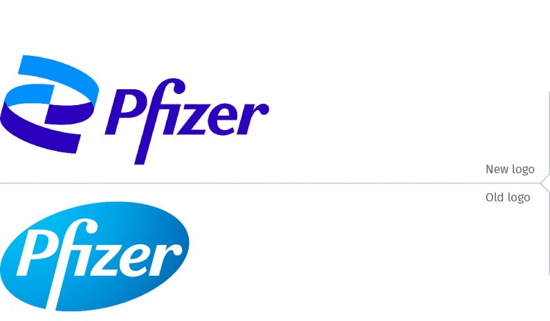
And since we are in the midst of the COVID pandemic, remember to get your vaccine as soon as it becomes available to you. So, of course, it is worth noting that Pfizer, the first out-of-the-gate with a vaccine, launched its new brand identity at the beginning of the month.
Now if only Pfizer could discover a vaccine for bad branding. One can only dream…