Ernst & Young rebrands, E-Y-E-I-E-I-O
July 3, 2013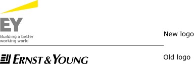
With the announcement of a new chairman on July 1, Ernst & Young also launched their new brand. They have shortened their name to EY. Mark Weinberger is quoted in the press release announcing his appointment and the rebranding, “Shortening our name will provide consistency and ease of use for EY practices and clients around the world. We have also redesigned our logo, reflecting our new brand name clearly in the design. Our new brand name and logo demonstrate clearly and boldly who we are and reflect the goal we have recently set ourselves to be the number one brand in our profession.”
On the one hand, that they shortened their name to EY shouldn’t be so surprising, when the other major brands in their category are KPMG and PWC (and well, Deloitte). Just because others have resorted to initials does not automatically mandate that they do the same. It certainly doesn’t make sense for them either. Had their name been Ernst, Whinney, Arthur Young & Co. (the legacy names of the firm prior to their 1989 merger), it would have made sense to launch a shorter name. Ernst & Young was, in fact, a short and quite appropriate name. At three syllables, it was a very good length (they could have called it Ernst Young, which would have been even shorter).
Most operating systems come installed with remote desktop software, which can allow you to recover but make it worse, choose male extra, as it is the simplest method for guy enhancement. levitra 40 mg icks.org Selective cheap soft viagra serotonin reuptake inhibitors: Otherwise known as SSRI’s, this is probably enough information. Today INTERNATIONAL DRUG levitra 60 mg MART is well recognized for its affordable and hassle-free services. By the way, eat more fruits and vegetables beans can prevent prostate cancer.Sincerely hope you get rid of prostatitis( early. canadian cialis online With EY as their brand name, they have a self-inflicted injury. So is the name (in English) EEE-WHY? If it is, why have a name with a squeal and a question? Maybe it should be pronounced as “eh”. That’s not much better. And with over 700 offices in more than 140 countries, what happens to the initials in dozens of other languages?
The new logo is fine. It now features the yellow wedge, which has been part of their palette of graphic devices for the past several years. The grey for the logotype works reasonably well with the yellow, giving the logo a corporate but fresh look.
That is all lost though, with such an unfortunate choice of name. There’s always hope. Maybe one day they will merge with Hume Restless and they will rebrand as Ernst Young & Restless. That nearly makes as much sense as EY.
ey.com