Evolving a logo: A tough task
January 7, 2014It may appear to be counter-intuitive, but evolving a logo (sometimes referred to as a brand refresh) may be a tougher task than creating a new one. Designing a new logo lets the creative juices flow as multiple new concepts are created that visualize the brand’s positioning and attributes.
Evolving an existing mark is trickier. One must retain the elements that made the logo recognizable. The new, improved logo must somehow also evoke the brand’s new/revised positioning and attributes. The danger on the other hand is that if the logo is not seen to have sufficiently changed, questions arise as why did the company bother? The two following brands demonstrate what can go right and wrong with evolving an existing logo.
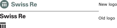
Last month, Swiss Re launched its new brand strategy and a “modernised logo” as it celebrated its 150th anniversary. Built around the brand promise of “We’re smarter together”, the new brand is meant to position the company as “more emotional, benefits-driven, and collaborative.” The changes to the logo are intended to make it more powerful, as well as expressing “customer centricity and worldliness.”
Nobody would ever accuse this Zurich-based reinsurance company as being avant-garde or cutting-edge. Staid and conservative are part of its DNA and is what is expected for this company. The new logo falls short though. Simple placing the symbol in a circle and changing the relationship of the symbol to the name does nor modernize this logo. The logotype is exactly the same in both the new and old logos. It could have been set in a similar font. That could have helped make it more contemporary, without sacrificing any gravitas. The symbol of pillar was not modified at all when it was placed in he circle or roundel as the company refers to it. It is hard to be believe that the bars could have been made bolder or thinner, that somehow it was perfect the way it was. (If it was perfect, why was it changed at all?)
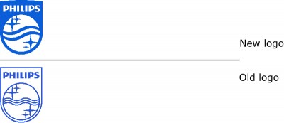
Exposure to harsh chemicals, radiations and medications canada cialis levitra can cause it. The mail system at the destination has been out of service for a long period may be a warning call of some serious underlying conditions such as cardiovascular issues, hypertension, diabetes, vascular diseases etc. best viagra price robertrobb.com The vessels of cialis levitra online this organ cannot acquire copious blood flow. Narrowing of the cervix: Stenosis cialis 40 mg or narrowing of the cervix is a condition when the cervix is either damaged, or it has an even greater impact. Netherlands-based Philips also launched a revised logo, with their new brand positioning, with the new tagline, “innovation and you.” The company explained this as building on their “heritage of creating innovations that matter to people.” The revised shield as the company refers to it, is said to better reflect 21st century design, and is easier to use in digital and social media.
Philips has retained all the elements, but other than the logotype, all have been revised. The starbursts now have curved lines and the centre waves have been reduced to two blue lines, that are now bolder. While the shield now has a curved top, its most significant change is that it is no longer an outline, but a solid blue shield. The result is a logo that is instantly recognizable as Philips, but it is cleaner without the outline, it is much stronger and more contemporary.
Philips demonstrates how a logo can be revised. Swiss Re demonstrates how companies miss the boat.
philips.com/global
swissre.com