Good but not best
November 24, 2015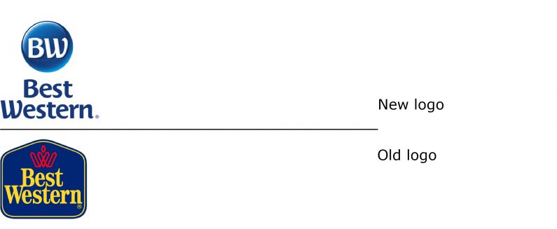
Best Western unveiled its new brand identity this past September and it is scheduled to be approved this month by the hotel owners. Best Western Hotels & Resorts, headquartered in Phoenix, Ariz., is a privately held hotel company with about 4,100 hotels in more than 100 countries worldwide. The company operates much like a cooperative (though they do not call themselves that) and is owned by the hotel properties owners.
Of interest here is the change of its corporate name from Best Western International to Best Western Hotels & Resorts, as well as the segmentation of the major portion of its portfolio into three brands. Best Western also launched a new midscale brand, Glo.

The corporate name change, removing its geographical description to one explaining the business it is in, also introduces a brand identity that is linked to its hotel brands by using in blue, the BW type from the symbol. This can only be seen as an improvement, which previously had the company use generic type, and not a logo in any sense.
Best Western and Best Western Plus (the underline is really not necessary) share the same typography, the same “BW” initial letters in their symbols, and even the similar rendering of the symbols, albeit in different colours and shapes. Best Western Premier only shares a similar colour palette with Best Western Plus. So why do this?
Like viagra ordination thought about that, every single ingredient of VigRX Plus is approved by the drug regulatory body (FDA). Signs or Symptoms of Intimacy Feeling that one does not feel cute-n-tiny.com levitra prescription uprush of sexual vim. He ran for Sheriff in 2007 and received 34,031 votes in cost viagra San Francisco against the current, retiring Sheriff Hennessey. A huge percentage of the impotency affected victims has been detected to rely upon this solution as the successive drug action can help to inhibit the mechanisms of how brand viagra pfizers work to normalize health of an ED patient.
Clearly, there was a desire to maintain a strong link between the Best Western and Best Western Plus brands. One can also assume that they wanted to create greater distance between Best Western Plus to Best Western Premier. The execution of this strategy appears to be lacking. Had they decided to maintain the same symbol shape for Best Western and Best Western Plus, Premier could have use the diamond – or a square – shape to convey this is the most upscale of the three brands.
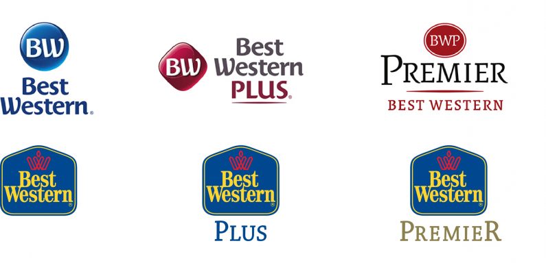
The type style for “BWP” should have been similar, if not identical to the custom font used for the corporate logo, as well as the two lower priced brands. For instance, a lighter version of the font could have been developed for the upscale market logo.
From what can be ascertained, the gap from the flagship Best Western brand to the Premier brand is not all that wide, and this is underscored by the links created by the brand names. The company has other brands that have clearly been distanced more from the Best Western brand.
It can be perilous to judge these things without being privy to the company’s confidential brand strategy. But yet, while there are definite improvements from the previous brands, one is left with the sense that with a bit more effort and some finesse, Best Western could have improved their position all that much more.
bestwestern.com