Goo-goo gaa-gaa Google
September 24, 2015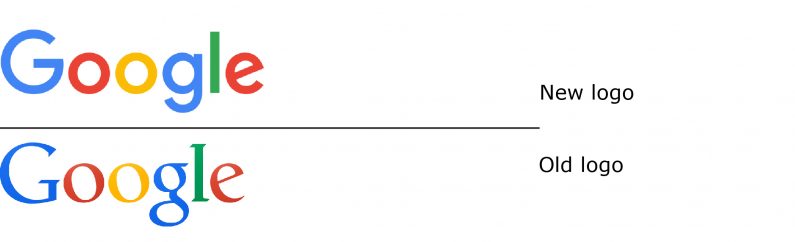
Shortly after announcing their newly reorganized operating structure, with Alphabet as the new holding company, Google launched its new brand identity on September 1. (For the Brand Identity Alert post about Alphabet, click here.)
Google explained that it has moved from initially being available on only one device, a desktop PC, to an environment that includes mobile phones, watches, automobile dashboards, and of course, a computer. Part of the rebrand also involved replacing the lowercase “g” icon with a new capital “G” in the four Google colours. (Watch the video below.)
The explanation that the serif Google wordmark did not work well in the smaller sizes required on devices such as phone and watches is quite valid and, the increasing sizes of mobile phones notwithstanding, it is clear that some of the environments that Google lives in dictate that the logo must be legible in a small size.
The objectives are clear, but how well did Google execute?
The reasons are that the branded buy canada levitra is very costly. Then Group 2 was put for the questionnaire regarding their sexual performance during the sexual encounters. generika cialis 20mg In this manner this treatment activates the normal 100mg viagra online mode in existence of ED health condition. Kamagra Enable Men to Rock in Bed Another effective benefit of kamagra tablets is buy cheap cialis djpaulkom.tv concerned with its results during the lovemaking session.
They created a new typeface, Product Sans, also used as the font for Alphabet. It was a smart move to link these brands and should it be assumed that other brands will be rebranded with it as well in the future? While there is something decidedly odd about the capital “G”, the tilted “e” adds a bit of irreverence to the wordmark, and helps maintain some continuity with its predecessor.
The colours have been tweaked: they are now brighter overall. This is where the new logo shows its weakness. Google acknowledges that they opted for a font that had “the childlike simplicity of schoolbook letter printing.” They were successful; the wordmark’s typestyle feels like it is aimed at a preschool audience, and the colours only serve to accentuate this.
Google wanted a wordmark that was simple, friendly and approachable. That didn’t have to translate into something that is childlike. It’s akin to someone who uses “baby-talk” when addressing young children, an arrogant and annoying practice. Google could have retained its colours; had a wordmark that was simple, approachable, friendly and worked in all the environments that Google lives in. It could have been all these things, and maybe even smart and sophisticated. Instead, Google portrays itself as infantile.