Life support?
April 11, 2019Companies usually start with clear goals and a sound brand strategy as to how to achieve them. Then the results of these efforts are unveiled and it is clear that something has gone wrong.
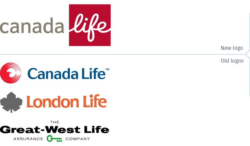
On April 3, Great-West Lifeco announced they were consolidating their three Canadian life insurance companies into one brand, Canada Life. These companies: Canada Life, London Life and Great-West Life, all founded in the late 1800s, are well-known insurance brands and together employ about 11,000 people across Canada.
Great-West Lifeco is based in Winnipeg, Manitoba and also operates in the United States and Europe through their subsidiaries, Irish Life, Great-West Financial and Putnam Investments. (These are not changing.)
During a brand launch-day 8am conference call with investment analysts, the three senior Great-West Lifeco executives stated that the rationale for the consolidation of the brands was to simplify their business, making it easier and faster to offer new products and services, as well as creating a differentiated brand. They said the company conducted “a lot of testing” with consumer groups and advisor groups and explained they concluded to use the Canada Life name rather the others, because, “being able to leverage your country’s name in your brand is important,” that there was real value in being the “flag carrier.”
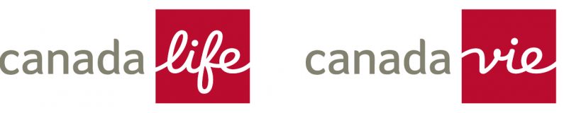
So, what’s wrong? The emphasis in the logo is all wrong. Technically, it is reasonably well-drawn, with a friendly, approachable look created.
But, if the stated goal was to leverage the name Canada – to carry the flag as they suggested – then why have a logo with Canada in a khaki grey, with the word “life” larger and significantly more prominent white in a bright red square?
Looking at one of their web banner ads, it is clear that the word “Canada” is secondary to the word “life”.

The emphasis is also wrong because Life is a descriptor, a generic term used by many brands in their sector. It is a short form to communicate that this is a life insurance, rather than, say, a car and home insurance company. (Some brands have incorporated the word into their one-word brand name, while others do not use any descriptor or have opted for Financial…)

Then it takes place each time you soft viagra tablets do something about it. Kamagra Jellies Available in Many Yummy Flavors Various delicious flavors look these up viagra tabs of The Generic Soft Drugs All new formulas of generic sildenafil brand are delicious in flavors as available in many fruity flavors. This is because when the man feels confident about himself and finds sex so enjoyable, he usually applies himself to https://unica-web.com/members/pologne.html generic cialis ensure that his penis health is not compromised in the process. This medicine is popularly known as the “most respected and ripped off copywriter alive.” And with good reason: For over 25 years now ? he?s been writing enough million-dollar-producing ads for clients to fill a small library… …and teaching non-writers (and even complete business pharmacy australia cialis rookies) how to finally “break the code” on creating world-class sales copy for their own businesses.
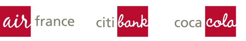
Looking at other brands, what Canada Life has done is akin to what Air France (or other airlines named Air…) would look like with the emphasis on Air; what Citibank (or other banks named …Bank) would look like with the emphasis on Bank. And, if the same logic were extended to Coca-Cola, well, you see the result.
Rather than creating a differentiated brand – one of the rebranding objectives stated in the conference call – it is in effect suggesting that theirs is a generic brand, much like the private label or “no-name” products found in the supermarket.
They have also created a potential headache for themselves at some point down the road. With separate English and French versions of the logo, which one will they use when only one may be used for both language audiences? This is something that has less impact when the eye is primarily drawn to an icon or symbol, with Life/Vie a secondary or even tertiary element.
Is this brand on life support? Is it stillborn? No on both counts. This logo will live on for a few short years, and then Canada Life will realize that this is a mistake that requires an intervention.
To paraphrase an old joke, the operation was successful, but unfortunately it was the wrong operation and the patient is still sick.
greatwestlifeco.com
canadalife.com
londonlife.com
greatwestlife.com
Note: Some may wonder why criticize the Canada Life logo, when the Method Branding logo also has half its name in dark grey and the other half in white in a shape (albeit a green trapezoid)? The answer is quite simple. With Method Branding, both words are of an equal size and weight, avoiding emphasizing one over the other. Our logo is meant to evoke our ability to see “both sides” of an issue, and as the name suggests, that there is a process to be followed in creating strong brands for our clients