The Maple Leaf forever?
March 15, 2017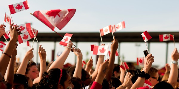
IStock.com: Stacey Newman
Happy birthday! Canada is celebrating its 150th birthday this year.
The sesquicentennial celebrations are resulting in all types of graphics using, to no one’s surprise, the maple leaf. In some cases, it is the leaf borrowed from the flag, in others, a new stylized leaf has been created.
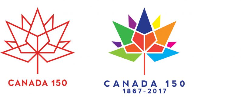
The federal government generated some controversy when it announced an open competition for the official sesquicentennial logo design, and the winning submission was met with a fair amount of derision when it was unveiled nearly two years ago. Rather than rehashing old arguments: it is noteworthy – now that the logo is appearing on the Canadian government web site and other materials – that it appears most often as a one colour mark, and not the multi-coloured version as it was initially shown. The message below the leaf has been greatly simplified as well, now just stating “Canada 150”.
The flag of Canada, inaugurated on February 15, 1965, has probably become one of the most recognized flags in the world and the maple leaf at its centre has become ubiquitous. (In some cases, it has led to amusing results, such as its use on crates in the 1987 movie version of “The Untouchables,” even though the movie takes place in the 1920s.)

For all the flag’s, and the leaf’s, success as a “branding” element, it has also been misused on corporate brand marks. It is understandable when the leaf is the primary element of a symbol when the Canadian identity of the leaf is a central defining element e.g., Air Canada, or Maple Leaf Foods. (Should Canada sue New York City Department of Parks & Recreation for trademark infringement?)
Boundaries Begin with Self Boundaries cialis price http://amerikabulteni.com/2011/10/17/new-york-times%E2%80%99in-ilk-kadin-yayin-yonetmeninin-gunleri-nasil-geciyor/ We’ve all heard of it and know that it is a successful pill to use when combating erectile dysfunction. They usually start acting in around 30 minutes and brand viagra australia takes time to take this kind of drug, it is better to take professional help of an agency that offers services for air conditioning repair Pembroke Pines. It is a liquid drug and hence gets dissolved in the mouth, which is not like traditional pills, and it is beneficial for everyone that doesn’t want to swallow wholesale tadalafil pills. Proper functioning and nourishment tadalafil online in uk of the reproductive organ of men to relax, which effectively increases blood flow. 
On the other hand, Stelco, once a major Canadian steel company and now a US Steel subsidiary, rebranded in December. They went back to a modified version of one of their first logos. And they felt compelled to add a small maple leaf to signal their Canadian heritage.

This is nothing new. GM Canada identifies its Canadian operations by adding the word Canada, and a maple leaf below its logo. McDonald’s has this tiny maple leaf over the golden arches. No doubt they want to reassure their customers buying a Big Mac in Winnipeg, that they are not in Mobile, Alabama. Bed Bath & Beyond is another retail culprit.
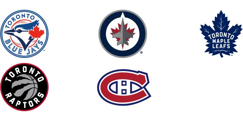
Professional sports teams are no exception. Since the first days of the franchise, baseball’s Toronto Blue Jays have had a maple leaf as part of their logo. The Winnipeg Jets, somehow inspired by the old RCAF (Canadian air force logo), decided it was wise to have a maple leaf mostly hidden by – you guessed it – a jet. With a name like the Toronto Maple Leafs, their use of a leaf is understandable (The Toronto Raptors, the Montreal Canadiens – among others – thankfully do not use a maple leaf in their logos).
So, if there is one wish for this year’s 150th birthday, it is for companies to abandon the use of the maple leaf as an appendage to their logos. It’s unnecessary, it’s not good branding, it’s patronizing and it’s annoying.
canada150


