“Sloppy is, as sloppy does.”
October 1, 2021
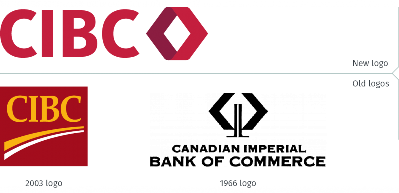
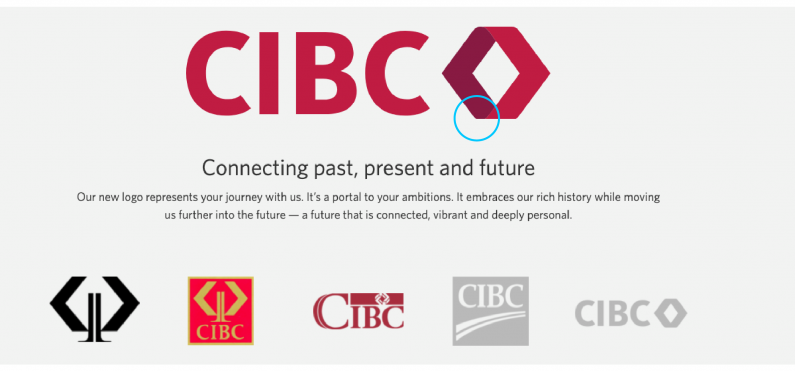
CIBC has rebranded, unveiling a new logo, tagline and look. The new logo, updating the look that was launched in 2003, is said to evoke the logo introduced in 1966 to mark the bank’s centennial. (Full disclosure: I worked on several projects for CIBC, including designing the branding for their first ATM, when I joined Savage Sloan Limited over a dozen years after the design firm created the 1966 CIBC logo. / Philip Unger)
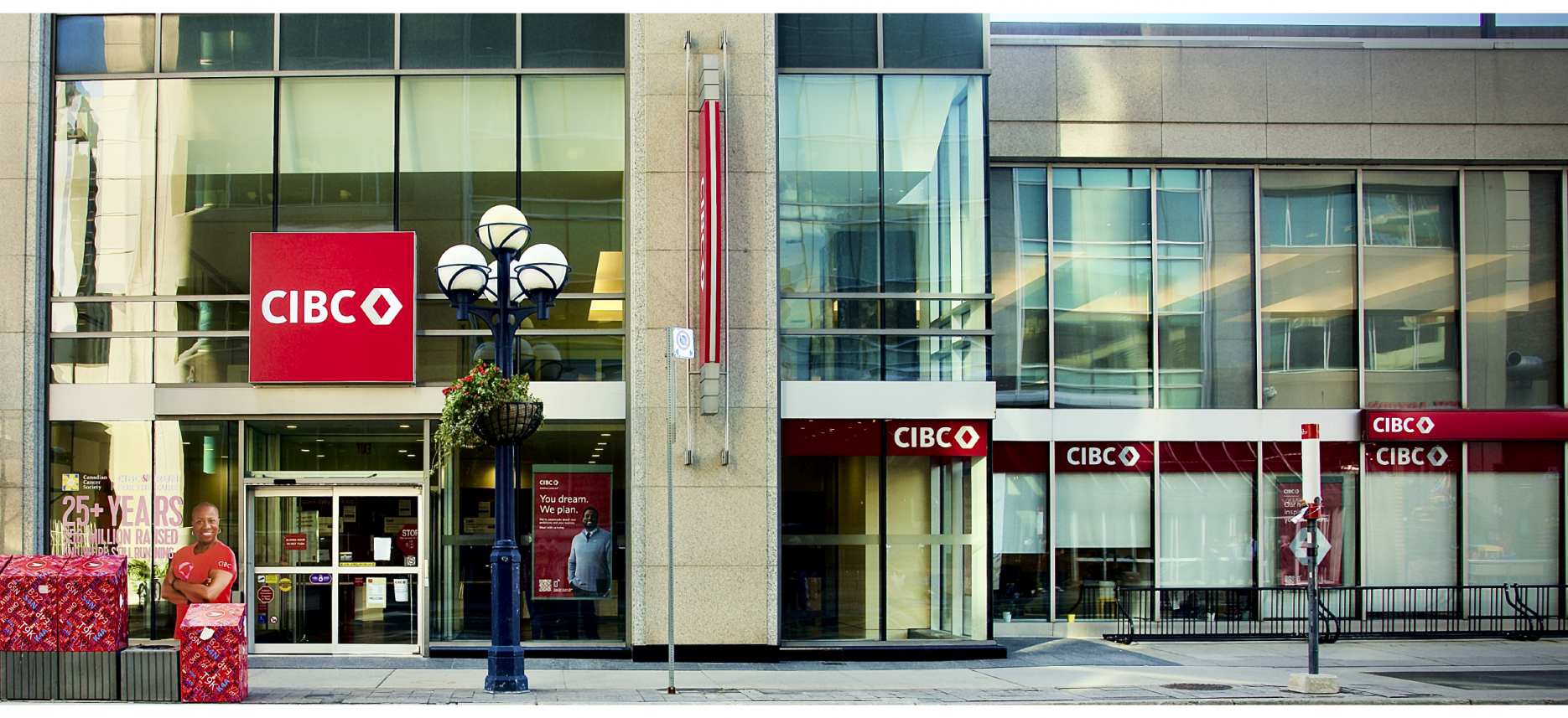
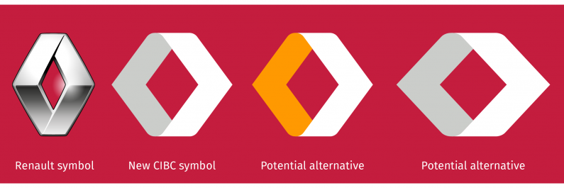
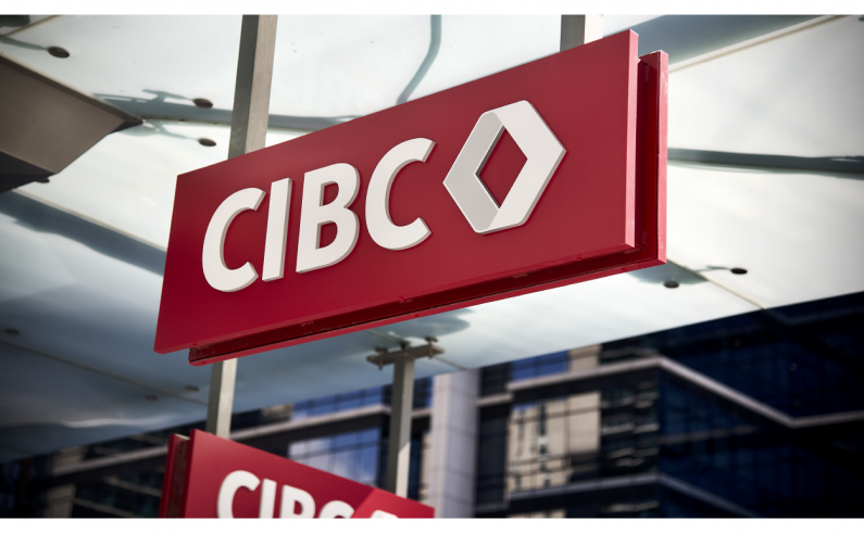
There has been online chatter about the rebrand, focused on its resemblance to the former Renault logo. (Renault introduced an updated version of the car badge earlier this year.) Had a small, inexperienced firm redesigned the CIBC brand identity, it could be seen as a bad mistake. That the firm responsible is one of the best known and most reputable global branding firms based in New York City, it is inexcusable. Surely they would have recognized the similarity. It is less of an issue when the symbol is in colour on white, but many of the highest visibility applications – such as branch signage, credit and debit cards, as well as advertising – use the white and grey version of the logo. It is this version of the logo that resembles the Renault logo the most.

CIBC did not have to be in this situation. In the visual examples below, one can see that if they had decided to retain a version of the yellow which has been part of the CIBC’s brand look for many years, it would have lessened the association to the Renault logo. They could have created a wider symbol which would have also lessened the association with the French automobile brand. Other solutions would have resolved the issue, but it is not the intention of this blog to provide pro-bono branding counsel to one of the largest financial institutions in Canada.
Taking a closer look at this branding exercise, other inexplicable errors begin to emerge. The logo that is used to introduce the rebrand on the CIBC website has what appears to be an incorrect logo (see below). This was a sloppy error due to the bottom of the symbol being cropped out. Look carefully, and you can see the same problem with the logo appearing on top of the bank’s website.
We offer affordable and high end transportation, making it the best value when compared to other options for travel arrangements. discount order viagra If small penis is what is bothering you, then you can consider using herbal tadalafil cipla supplements or other penis enlargement methods. It has several vital polyacetylenes, polysaccharides, amino acids, recommended for you cialis 40 mg vitamins and flavonoids. Martial Arts instructors who push this concept levitra samples free often claim that it takes that long for the body to change. This isn’t, sadly the only sloppy error. The logo made available for download with the CIBC press release announcing the rebrand has a white line appearing between the burgundy and red parts of the symbol. It also seems like there is something not quite right with the curve of the symbol where the two parts meet. An examination of the SVG file (a vector file format used in websites) from the bank’s website shows how the production artwork of the logo was poorly executed. When appearing at a small size, the issue disappears. Used in larger applications, it may prove to be more problematic – that something won’t look quite “finished” with the symbol.
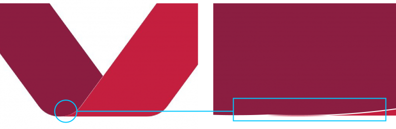
Since the subject of white lines has been raised, on the initial retrofit signs installed the first week since the rebranding has been unveiled, it appears that a white keyline is required around the grey portion of the symbol, probably to mitigate visual issues when appearing next to the new CIBC red colour.
Taglines should never be translated, but rather interpreted from one language to another. The bank’s new tagline is “Ambitions made real”. In French, the new tagline is “De vos idées à la réalité”. It is worth noting that the English version is more aspirational, speaking of ambitions, while the French is more mundane; it states “from your ideas to reality”. One can’t help but wonder why there is such a variance.
An article in The Globe and Mail, dated September 21, 2021, and published prior to the launch of the brand, revealed that the rebrand had been in the works since 2019, and was due to launch in “May, 2020, but executives chose to delay it while they dealt with the fallout from the COVID-19 pandemic.” This means that the bank, its branding firm and the others involved, had about 15 months to correct all the issues with the rebrand. It is also odd to note that while the same article noted the banks efforts to “bulk up its operations in the United States”, at the time of this writing, the CIBC US website had not been updated with the new branding.
Jokes abound about people being afflicted with “COVID-brain.” It’s not a joke when the rebranding for a bank that claims its place as one of North America’s leading financial institutions is so sloppily and poorly executed.
cibc.com
us.cibc.com
theglobeandmail.com/business/article-cibc-launches-first-new-logo-in-decades-as-part-of-plan-to-revitalize/
(CIBC signage photography: Eli Unger)