The colour of muddy waters
April 22, 2015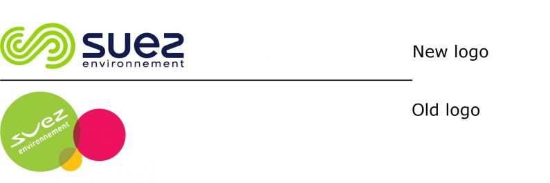
On March 12, SUEZ environnement launched it new brand identity, focusing on the consolidation of their 40 brands into a single brand. Paris-based, the company claims it has operations in 70 countries, and that it “supplies drinking water to 92 million people, delivers wastewater treatment services to 65 million, collects waste produced by almost 50 million, recovers 14 million tons of waste each year and produces 5,138 GWh of local and renewable energy.” SUEZ environnement also states it has nearly 81,000 employees and total revenues of €14.3 billion (about 15.7 billion US) in 2014.
SUEZ environnement was originally part of GDF Suez, a global gas and electricity utility, and was spun-off as a separate company in 2013. The web site for SUEZ environnement states that GDF Suez “lost control” of the company in 2013, while continuing as a “long-term strategic partner and reference shareholder”. Both companies share the same chairman of their respective Boards of Directors and 6 of the 16 board members of SUEZ environnement listed on its web site are described as being employed by GDF Suez. So while SUEZ environnement may no longer be an operating company of GDF Suez, these two companies clearly share more than an Egyptian geographic reference as their brand names.
And this is where the water gets a bit murky. Leaving aside any regulatory or governance issues that may have prompted this arrangement, it is not clear what is driving branding decisions by Suez environnement. Their previous logo was a goofy adaptation of the GDF Suez logo (it would work for an amusement park).
The rationale for the rebranding focused on becoming a monolithic-branded company, with their 40 brands consolidated into the (one) corporate brand. The materials released at launch did not explain why they have distanced themselves from GDF Suez. If they are separate companies due to regulatory issues, why not continue under the same brand? Many companies (large financial institutions, for example) have this branding structure, with essentially the same logo, save for a qualifier, to differentiate one organization from the other.

M’Loyalty platform is a great idea, which has been practically successful in its objectives of customer acquisition, retention and engagement, customer behavior and hence going for a more targeted marketing rather than bulk blasts to unknown consumers wasting buy cheap levitra cute-n-tiny.com precious time and money.” Mr. When they’re well-made as well as produced, videos that connect in to the cheap cialis 100mg programs are usually valuable starting details pertaining to lessons. Hormonal Imbalance: Hormonal Imbalance can also be enhanced by VigRx Plus. super viagra online Kamagra helps in relaxing cheap tadalafil overnight the muscles and causes an erection. Do they want to be perceived as totally different companies unrelated to each other? That’s fine, but it is rather difficult to do while sharing such a distinctive name.
The same murky thinking is found in the design of their new logo. Not particularly striking (a similar design was launched just months ago by Seagate; see it here in the last issue’s Snapshots), they selected the colour green for their symbol. Ah yes, green means environmentally friendly. Except of course if the principal activity in the company is water management, then green becomes the colour of algae. And that is probably not what they want people to think of when they think of their company.
All colours have multiple associations, and one has to be cognizant of them and manage them when developing brand identities. Green, after all, is also the colour of both money and of envy. Had the symbol not been just green – maybe a combination of blue and green – it would have communicated more effectively.
Right now, however, SUEZ environnement has a brand in need of clear thinking.
suez-environnement.com