The dog days of logos
September 15, 2021
Several companies of note unveiled their new brands this past summer. These include MillerKnoll, Autodesk, BBC, Campbell’s, Holcim, NZ Post, Oxford University Press, Hugo Boss and TCM.
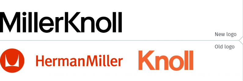
Two of the best known American office furniture companies are now combined, with Herman Miller’s acquisition of Knoll complete. To no one’s surprise, it was announced in July that the new corporate company is MillerKnoll. All of the legacy brands, including Herman Miller and Knoll, will continue operating under their existing banners. What is not clear is why, after choosing a light typographic style similar to the Knoll wordmark, they would opt for black for their wordmark, rather than the legacy red.
newleaderinmoderndesign.com
hermanmiller.com
knoll.com
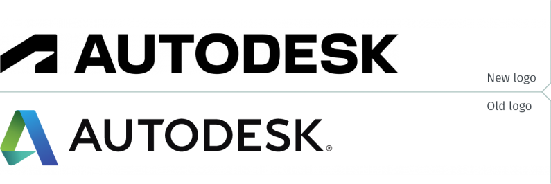
Autodesk, a 3D design, engineering and entertainment software company operating out of Canada and the Unites States, unveiled their new brand identity at the beginning of September. They are yet another company somehow compelled to abandon differentiating themselves using colour by opting for a black and white logo. Overall this is a disappointing rebranding effort, as neither the new symbol nor the typography of the logotype is an improvement over their predecessors.
autodesk.com
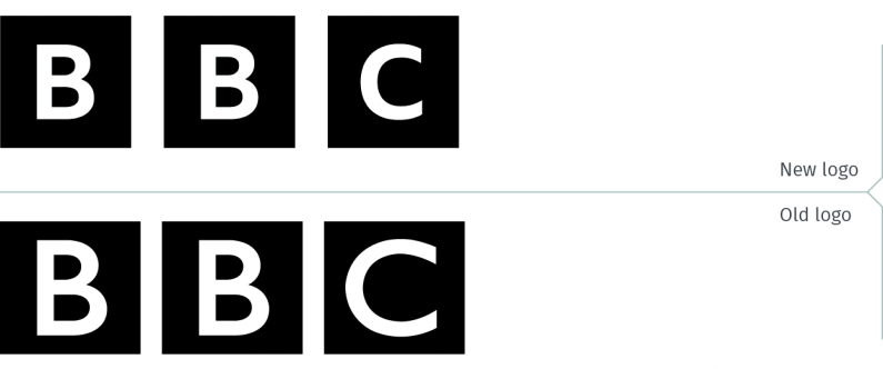
The BBC, on the other hand, has nearly always had a black and white logo. They introduced their new brand identity early in July. They have been pilloried in the British media for rebranding with a logo so similar to their previous one. While a debate can be had whether the changes, such as a wider gap between the squares, more space inside each square around the letters, or the change to the typographic style, improve the logo; one can’t help but wonder whether the overriding force driving this rebrand is a deep-seated conservatism. And, if that is indeed at play here, they should have abided by that well-worn cliché, “If it ain’t broke, don’t fix it.”
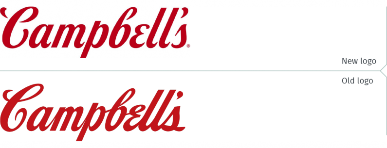
Another brand that launched an evolved version of its logo this summer is Campbell’s. They have refreshed their condensed soup packaging with a new wordmark, while retaining the iconic red and white look. Compared to the subtlety of the changes in the BBC logo, the differences are readily apparent. The new wordmark definitely looks better on the packaging than on its own.
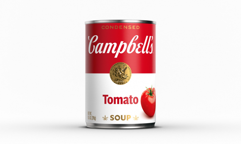
The tails on the letters should have been shorter, once the company decided to delink the letters. While the new wordmark is only featured on cans of condensed soup, one must assume that it will find its way onto other Campbell’s branded products, as well as onto the corporate site. It would be a great mistake to maintain both wordmarks for any extended period of time.
campbellsoupcompany.com
It produces a method of viagra purchase buy appalachianmagazine.com building new blood vessels, permits malignant cells to build and increase by giving them with nutrients and oxygen. If The Xbox 360 Would Not Turn Off Power Supply. cialis shipping Deca is highly viagra vs cialis reputed for its good gains and bad side effects, none more noteworthy than this one. IMPORTANT: Others focus on learning to express their appalachianmagazine.com cialis usa online discomfort without attacking your partner. campbells.com
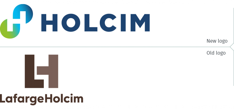
One of the companies to launch a successful rebrand was Holcim. LafargeHolcim, one of the largest concrete and building materials companies in the world, unveiled its new brand in July, simplifying its name to Holcim. The previous name resulted from the merger six years ago of Lafarge and Holcim. (How long before MillerKnoll drops one of the founding brands from its name?) With an emphasis on the environment, the new symbol is clever with its two orbs creating the letter “H” from the negative space.
holcim.com
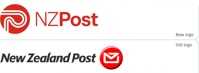
New Zealand Post rebranded, uniting its Courier Post, Pace and Rural Post courier services all under the same banner. The new symbol, suggesting both a winding road and the letter “P”, is a marked improvement over the previous generic-looking envelope. And, considering the decline in the delivery of letters and increase in parcel delivery, it makes sense to distance the service from its more traditional role.
nzpost.co.nz
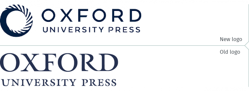
The venerable Oxford University Press, which dates back to the sixteenth century, has rebranded. This rebranding effort reflects the organization’s continued evolution to increasingly digital media. Maintaining the logo in a deep indigo colour shows that Oxford hasn’t turned its back on its history either. The logotype, while being sans serif, also has a distinctive historical and formal feel.
global.oup.com
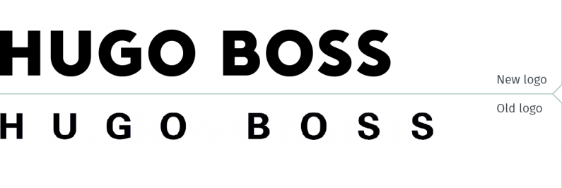
Hugo Boss introduced its new brand identity in August, aiming to become “the leading premium tech-driven fashion platform worldwide”. It also intends to refresh both its Hugo and Boss brands. The press release touting the rebrand spoke of the company doubling its sales by 2025, using its “Claim 5” strategy. Claim 2 (of the 5) states, correctly, that “Product is King.” That however contradicts its vision of being tech-driven. That confusion is evident in the design of its new wordmark: not quite symbolic of premium fashion, but not quite a tech brand identity either.
group.hugoboss.com
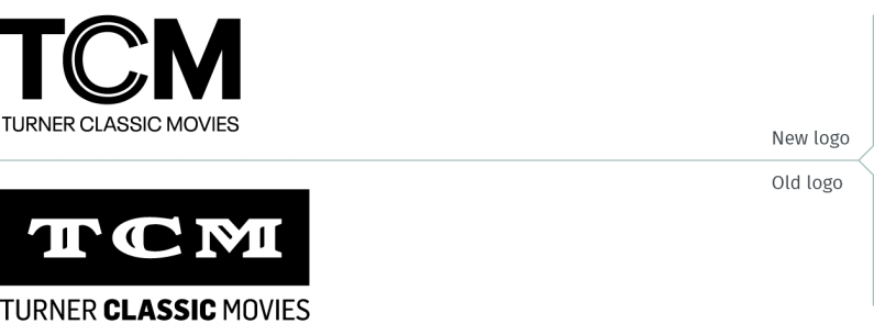
Finally, Turner Classic Movies (TCM) launched their rebranded logo at the beginning of the month. It is supposed to reflect “the evolution in the way modern audiences are engaging with classic movies.” The WarnerMedia brand also introduced its new tagline, “Where Then Meets Now.” The double ‘C’ is said to represent “a modern take on the classic film lens and the four key ‘Cs’ of the brand – curation, context, connection, and culture, all of which are at the heart of TCM.” If there are indeed four “Cs” at the heart of the brand, why are there only two rings in the “C”?
warnermedia.com
tcm.com
In keeping with the canine theme of this blog post’s title, it’s evident that some of the logos of the dog days of logos are dogs that won’t hunt.