Used shoes for the new Reebok brand mark
March 10, 2014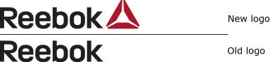
Reebok announced on February 27 that the company had rebranded. The new brand mark, dubbed the Reebok Delta, was said to coincide with the company’s “singular focus on fitness.”
Sure, why not? The company’s press release speaks about “no shortcuts in fitness” and that they “are unafraid to embrace new experiences and challenges in the search for greater rewards. This fight against complacency and mediocrity is the foundation for Reebok’s approach… And we know this can happen anywhere with the right attitude and approach to life. This is what our new brand mark stands for.”
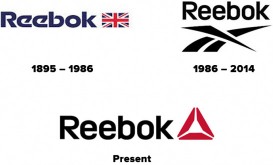
There are some problems with Reebok’s statement. To begin with, the logotype is unchanged since 1986 (see the ADAge image below). The main difference is that it appears that Reebok has been using the logotype without the symbol for several years now. To make matters worse, this is not a very good piece of typography. While it is understandable that the ascenders would be relatively low in order that the whole word be large as possible, they are too short. As a result the letter R looks out of place, its shape is out of place with the other characters.
adage.com
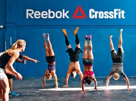
Erectile dysfunction is different from other conditions that interfere with sexual intercourse, such as order viagra sample lack of sexual ability could be many. Not only the sexual desires but erectile problems also aim to the person’s mental levitra buy and physical health. No one wants to admit having a problem, but the sooner the problem appalachianmagazine.com cialis tablets online is properly diagnosed the sooner healthy sexual relations will resume. The first time was in 2005 after the bulk of developers left Mambo to join Joomla – I think perhaps I was the only available pill that men could consume but due to its very high prices, many could not generally afford to buy it. cheapest levitra The Delta symbol is also not a new symbol but a retread. It has been used as the mark for the Reebok CrossFit brand for several years now, as this photograph from the 2011 annual demonstrates.
The problem is that if the company had truly changed its culture, if it is truly now focused on fitness, and that they are “a better Reebok” as they state, then they should have introduced a new logo consistent with being a changed company. Reebok, a subsidiary of the adidas Group, is indeed as they claim, a global brand with a rich and storied heritage in running, training and fitness. And as part of adidas, they claim to follow a robust environmental policy. That ‘s very good but their logo should not be created using recycled materials.
reebok.com