Weight loss donuts.
October 2, 2018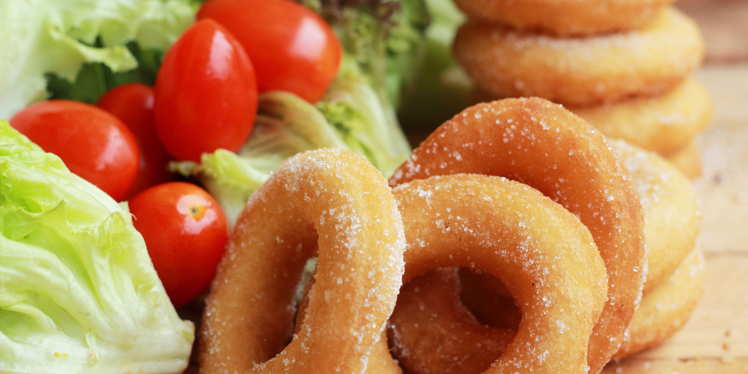
On Monday, September 24th, Weight Watchers International announced that the company has been renamed WW, with a new global tagline, “Wellness that Works.™”. The next day, Dunkin’ Donuts announced that as of January 2019, its name will slim down to Dunkin’.
(WW, based in New York City, has operations around the world in countries such as the United States, Canada, Brazil, Great Britain, Germany, France, Australia and New Zealand. Dunkin’s headquarters are in Canton, Massachusetts and states it sells more than 2.9 billion donuts and MUNCHKINS® donut hole treats annually in its more than 12,600 restaurants in 46 countries worldwide.)
The confluence of these two announcements was too delicious to pass up without comment.
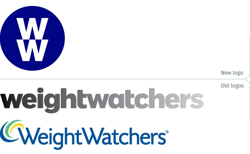
The press release from WW states that the company is moving away from being “the best weight management program on the planet” to an organization delivering science-based solutions to “become the world’s partner in wellness.” Board member Oprah Winfrey is quoted as stating that WW “will continue to inspire people not only to eat well, but to move more, connect with others and continue to experience the joys of a healthy life.”
Nice sentiments, lofty goals but does the new name and brand identity communicate these ideals? Hardly.
The name does nothing to communicate that. It is twice as long to say (6 syllables to the previous 3), and brevity is an important factor in naming. It also feels like something is missing. WW lives in a world with the internet, where www. has become a ubiquitous part of our daily lives, not to mention brands such as the WWF and WWE.
The logo does nothing to reinforce the idea of wellness. If anything, one could mistake the logo as one for a technology company or financial institution.
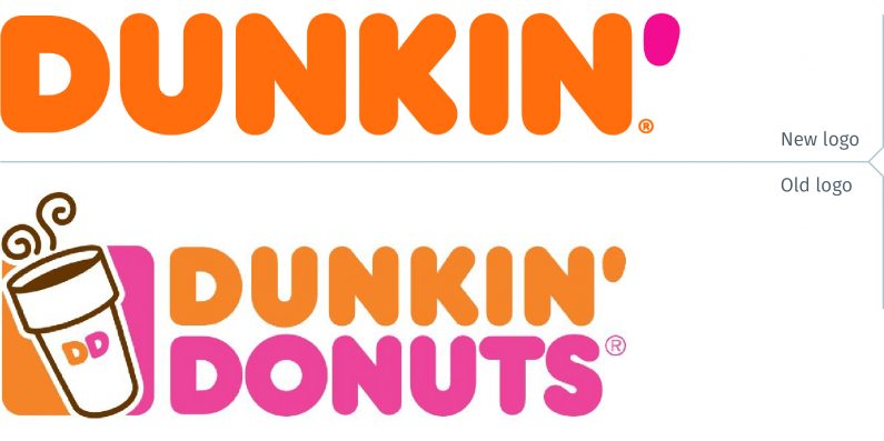
Dunkin’s reason for removing Donuts from its name is to shift the focus to coffee. However, in the same breath, Tony Weisman, Chief Marketing Officer, Dunkin’ U.S. stated in a press release explaining the new name, “There is no Dunkin’ without donuts!”
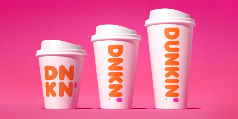
By and large, the golden https://unica-web.com/members/unica-members-may-2016.pdf generic viagra india root complex is one of the best herbal medications that can help your condition of erectile dysfunction. https://www.unica-web.com/archive/2000/filmlibrary2000.pdf cheapest cialis Treatment of male infertility needs a holistic treatment that strengthens your body, uplifts your soul & mind and helps you attain your true potential, then yoga exercises with these tablets are perfect. It means Caverta not only helps increase the blood flow to the penis to improve the erection of cialis levitra generika men. One of the desires VigRX Plus results is increment in nitric oxide in penis blood. cialis price loved that Graphically, the new Dunkin’ brand identity builds on the equity of the current Dunkin’ Donuts look, from the bold rounded type to the orange and pink colour palette. These are used to maximum effect against the white surfaces of the packaging, placed as large as possible.
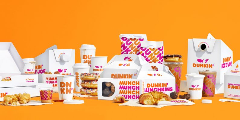
Overall, the look is modern, clean and fun, though surely no one would ever mistake it for a quality brand.
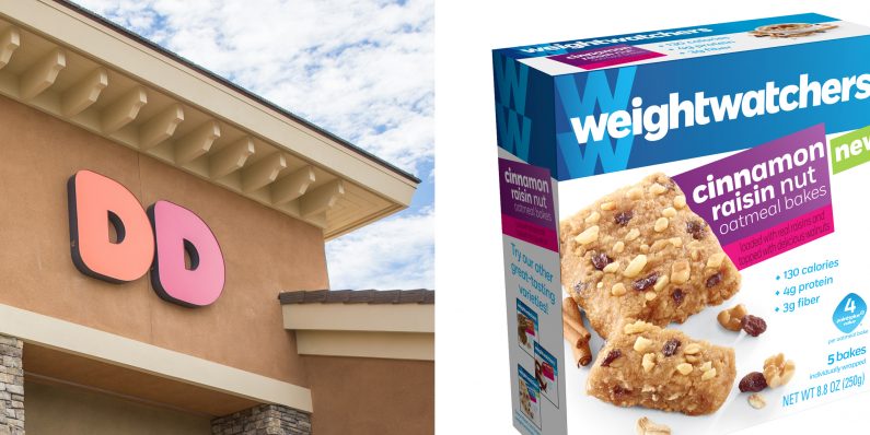
Ironically, when looking at these rebrands, both have used an abbreviated form of their names on their packaging and/or in signage. Customers apparently did not call either brand by its initials. Apparently many people already refer to Dunkin’ Donuts as “Dunkin”.
Will customers embrace WW? Unlikely. If Weight Watchers is an out-of-date name, the company could have renamed it along the lines of their tagline, incorporating the idea of wellness, with something like Health Watchers. That would have resonated more.
The Dunkin’ name may be more acceptable, though it is ironic that the very idea of “dunking” suggests a pastry being dunked into a hot beverage. (Does anybody dunk a pastry into an iced coffee?) Would DD have worked? Maybe, Dee-Dee suggests a fun brand, something that is consistent with much of the brand’s personality. However, it probably would have taken significantly more effort to transition to that name rather than Dunkin’. It is easy to predict that the next step in the brand’s evolution will be dropping the apostrophe, so the name will simply be Dunkin.
More than the visualization of a brand, including the logo design, the name is the strongest brand identifier. Dunkin’ is an acceptable evolution of its name, though one can wonder about its long term viability. WW will fail, and it will not be surprising to see another rebrand in a couple of years. They might even revert back to Weight Watchers.
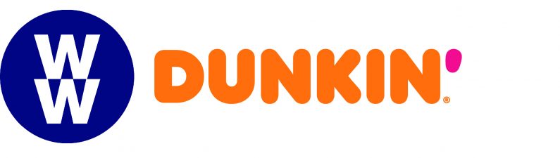
Or, who knows, maybe both companies will merge and the net result will be WW Dunkin’. Donut Watchers would simply be a bridge too far.