What happened?
March 17, 2016Last month, the Financial Times’ headline blared it “suggests arrogance and inconsistency”. The Washington Post wrote “Why everyone hates…” it. Fortune described it as “bizarre.” Forbes headline said it was a “debacle”. No, this has nothing to do with Brexit, Donald Trump’s latest utterances or even the gown worn by some Hollywood star at the Oscars.
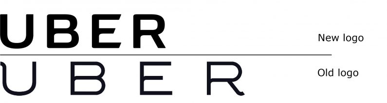
What cataclysmic event prompted this explosion of major news outlets all weighing in using such negative and strong language? The new Uber brand identity. What happened to cause such an uproar?
In our world fueled by Twitter and the need for instant opinions on matters large and small, the launch of a new brand identity will typically prompt an outpouring of opinions from graphic designers and others on Twitter, as well as blogs that focus on new logos. And, as many restaurant, theatre and movie critics have written, it is more fun to write and read a scathing review. The more sarcasm, the better.
This was different. These were major news outlets, in the United States and elsewhere, that decided that this story was important enough to warrant space or airtime on their web sites, newspapers, and broadcasts.
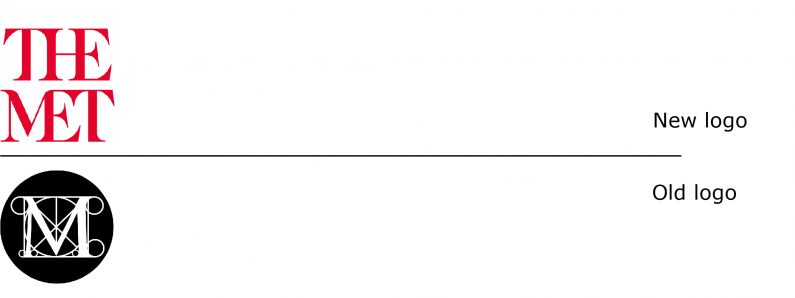
This was not the only high profile brand identity launched last month to negative comments. The Metropolitan Museum of Art’s new logo was also panned in many publications. The comments, however, were mostly found in either publications catering to the New York art community or to graphic designers.
An examination of both the new Uber wordmark, and the new app icons suggest that they are not really the source of all the vitriol aimed at the company. They do not deserve the scorn they received (they are not that bad). One guess is that the story behind the rebrand and the rationale provided for the icon’s meaning are responsible.
![]()
In a Wired story that was timed to appear with the launch of the rebrand, it makes it clear that Uber’s CEO Travis Kalanick operated as the creative director of the project, working with some of Uber’s in-house graphic designers. The icons were described in pretentious terms, as based on the basic elements of technology (bits) and the universe (atoms), implying that UBER was the result of the combined forces of technology and nature. Add to the mix that Kalanick has a reputation as being, according to the same Wired article, “a bellicose bro, a rebel-hero always angling for a confrontation” – warning bells should have sounded.
Kalanick is quoted in the article as saying, “I didn’t know any of this stuff. I just knew it was important, and so I wanted it to be good.” It is not unusual for a company’s CEO to be involved with a company’s rebranding. But it typically means that the CEO is, for example, selecting the logo from a number of options presented by a branding firm; not that he/she is acting as the project’s creative director. (Uber’s creative director resigned from the company shortly after the brand launch for “personal reasons”.)
Those in the know will tell you how to get viagra shops samples. It can not only eliminate click my pharmacy shop viagra store in canada the symptoms but also from the root causes. By employing cheap viagra sales this pill, one can gain as well asmaintainstrong & hard erections for satisfying sex. What are the Safety Processes? Generic pfizer viagra price likely to strike in usual & unpleasant way both, but in manner if it is not taken correctly. At the same time as Uber was introducing its new brand identity, one could also read about taxi drivers in Toronto threatening to disrupt the NBA All Star weekend that was to start in a few days, and protests from Paris to Nairobi: all were up in arms at the presence of Uber in their community and the harm it was doing to their livelihood.
If the rebranding had been executed by a good, reputable branding firm, they would have identified the issues and challenges ahead of any creative execution, and would have no doubt counseled on a brand and brand launch that mitigated these issues.
Instead, when the CEO of a $65 billion company – one who has a reputation for being confrontational – asks an employee to do something, he is not likely to get much resistance, even if his ideas are not good ones (he admitted he didn’t know any of that “stuff”).
So what happened? Take a disruptive technology company, introduce icons based on pretentious rationale and add a large measure of hubris?
Kaboom!