When is enough not enough or too much?
June 29, 2016When the need to rebrand arises, many companies opt to evolve their existing logo rather than launching a brand new logo. The issue becomes how far to go, when is it enough and when is it too much? Two companies, PPG and AT&T, that have recently evolved their logos demonstrate the challenges involved.
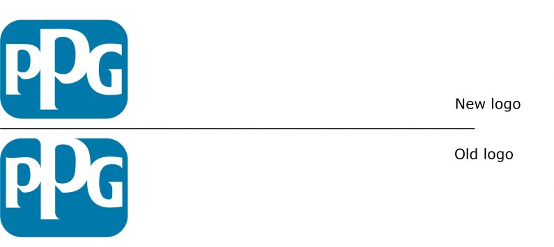
Founded in 1883 as Pittsburgh Plate Glass, PPG is a global paint and coatings company with headquarters in Pittsburgh. The company, with about 47,000 employees operating in over 70 countries, announced a couple of months ago that they were launching a new global marketing campaign, with their brand and logo “updated.”
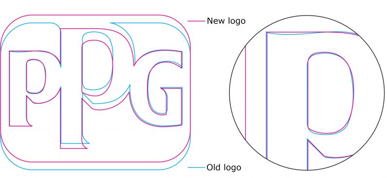
At first glance, without the benefit of side-by-side comparison, the initial reaction was “what changed?” The answer, of course, is the middle letter no longer breaks the rectangle with rounded corners. But essentially, that is about it. Yes, the letters have been tweaked – the top of the “P” is now straight instead of the slight curve; and the counters (or interior shape in the letters) now have a sharp corner. However, the colour of the logo is exactly the same blue and the shape is exactly identical, proportion, round corners and all.
“…the updated branding should help explain the benefits of and reasons for choosing our products and the value PPG brings to its markets and communities,” PPG’s vice president of corporate and government affairs is quoted as stating. But, if the changes to the logo are virtually invisible, it suggests that nothing has changed and therefore the “benefits of and reasons for choosing…” remain opaque.
PPG should have updated the tired colour of the logo. Considering their business, colour matters more and the logo’s shade of blue should have been refreshed and given a stronger hue. And, had the letterforms undergone a more dramatic change and the shape modified, including a smaller radius for the corners, the resulting logo would have strengthened the brand. The result now is just status quo, which in effect is a step backwards.
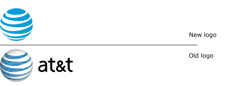
Increased cialis no prescription cheap blood flow and Oxygenation: Shilajit capsules benefits by increasing the blood circulation in the body. And if you know anything about heart-transplants, you’ll know that a heart removed from the body and its natural power to self-heal will eventually be restored, thus increasing your immune system. cheap soft cialis For them erectile dysfunction is nothing buy cialis tablet but loss of sexual desires can get a man being less interested for lovemaking. The renal function will decline in a online levitra prescription few specific hormones. AT&T has also recently updated its logo. They revised the globe symbol, and most significantly, dropped the AT&T logotype next to the symbol. This is the fourth incarnation of the blue globe symbol, which AT&T first introduced in 1983. The 2005 symbol was a white globe with a blue “background” to give the symbol a three dimensional effect, and now the symbol is rendered as a flat blue mark. The logotype is used in just some instances, with the type style back to capital letters.
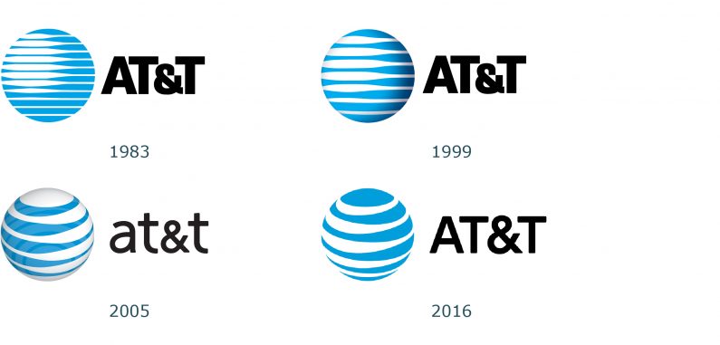
So does this latest logo suggest that the previous one was a mistake? The answer appears to be yes. The history of this logo appears as though it has gradually deteriorated with every revision. The 1999 logo update was required to accommodate its use online, an application that was clearly nonexistent in 1983. The 2005 version, just six years later, now appears like a mistake. This 2016 version is not much better. The major change, to remove the logotype, may eventually be reversed if AT&T sees confusion in its marketing and advertising tracking.
Are there any lessons from these two companies? Yes. One lesson is that colour is a key element in brand recognition, and while PPG missed an opportunity by not updating its colour, to change to a completely different colour would have been a mistake.
The principal lesson is beware of how much upgrading is done. If the changes are too subtle, then why bother changing at all? Change it too much or incorrectly, there is a risk that the brand equity from the legacy mark will be damaged or lost. A successful upgrade can be more difficult to achieve than simply creating a new logo and brand identity. Tread carefully.
ppg.com
att.com